lakeside
You must be logged in to post a comment. Login here.
a
andychild
Report Abuse
looks better. I'm re-doing the lighting at the moment. shall post new image in the morning
G
Gogon Lingkungan
Report Abuse
Nice Picture for me,
whose a newbie in 3D Architect [IMG]http://freeimagestock4you.com/img/X/0.png[/IMG]

erick gustafson
Report Abuse
Waiting on a render I went ahead and messed with the levels and color balance...
[ATTACH=CONFIG]41468[/ATTACH]
E

Travis Schmiesing
Report Abuse
Also, you want to color manage from the very second the image is opened in Photoshop. You didn't mention if you are working in a color calibrated environment also.
a
andychild
Report Abuse
tried big improvement. not exact but 95% there. Thankyou very much. its been perplexing me for quite a while.:D
a
andychild
Report Abuse
ill give it a go, thanks
Travis Schmiesing
Report Abuse
90% of the time you are going to want your final image to use a sRGB profile and view it in an application that is color aware. I say sRGB profile because it is what the majority of displays are targeted for, so it is your best bet at uniform display across multiple machines and devices. Though no browser it is natively color aware so it is a bit of a mute point when viewing in forums.
Also, as you probably know, the quality of monitors varies greatly which could be why it is blurry, but also the ability of applications to display pixels on the screen differs.
A lot of these are out of your control, but I would embed the sRGB profile, and then test view it on a lower quality monitor as part of quality control.
a
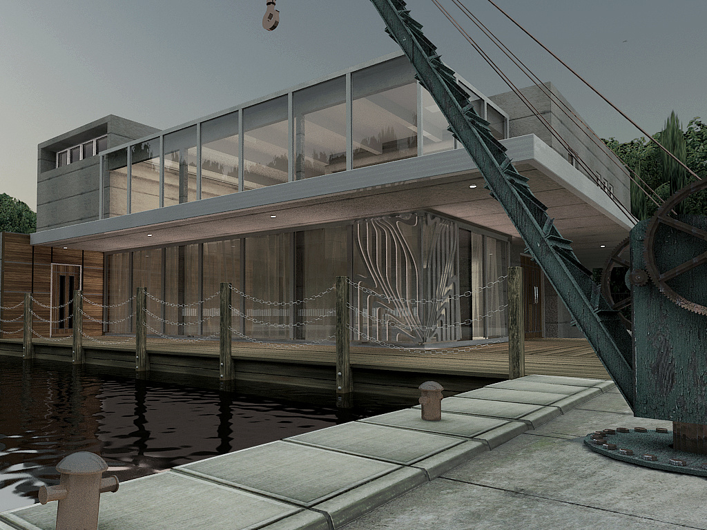
andychild
Report Abuse
Thanks for your response. I agree the image is dark. I have this problem with lots of my work, looks fine on my screen and really dark on other PC's . I am using gamma 2.2 and have tried to get to the bottom of this problem, but no solution so far. So if you have any ideas they will be greatly received. The other thing that I have noticed is that the image is sharp on my main machine but slightly blurring on other PC's (?)
As for your other points. I agree about the corner panels they look terrible, but were requested by the client. The design is part of their logo and they wanted it on the corner of the building.
The crane is a feature on the site and will be left were it is, but i'll shift the camera round so that it is not so prominent

Ryan Watson
Report Abuse
First - I'd post in the WIP forum.
Image is really dark. Could be vastly improved by simply upping the level adjustment. There's no shadow or contrast in the image, which makes for a grey/dull render.
The foreground crane is cool, but is seriously detracting from the architecture (it's too much of a focal point)
The corner of the building seems really out of place - style doesn't match the rest of the structure. I had to zoom in just to understand what I was looking at.