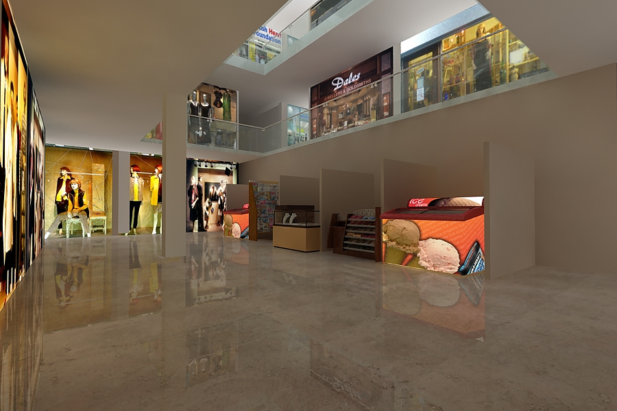
commercial interior
You must be logged in to post a comment. Login here.

Justin Hunt
Report Abuse
Lights in the ceiling and joints on the floor.
Put the shop front image planes behind glass to give more depth to the shops.
The white Balance is way off, if you cool the mid tones it will really lift the image.
jhv

aman singh
Report Abuse
[ATTACH=CONFIG]45874[/ATTACH]
done some changes.
K
Kris McIsaac
Report Abuse
I think it looks pretty good. Maybe add a bit of A/O between those wing walls and the back wall and also where the columns hit the underside of the floor above. Personally I feel the floor is a bit glossy, possibly blur the reflection or add some fall off. As a small detail, would there be a skirting of any sort around the walls and possibly columns? It may help ground everything which can get lost on glossy floors. And one final thought, the empty bay on the right unbalances the image a bit.

