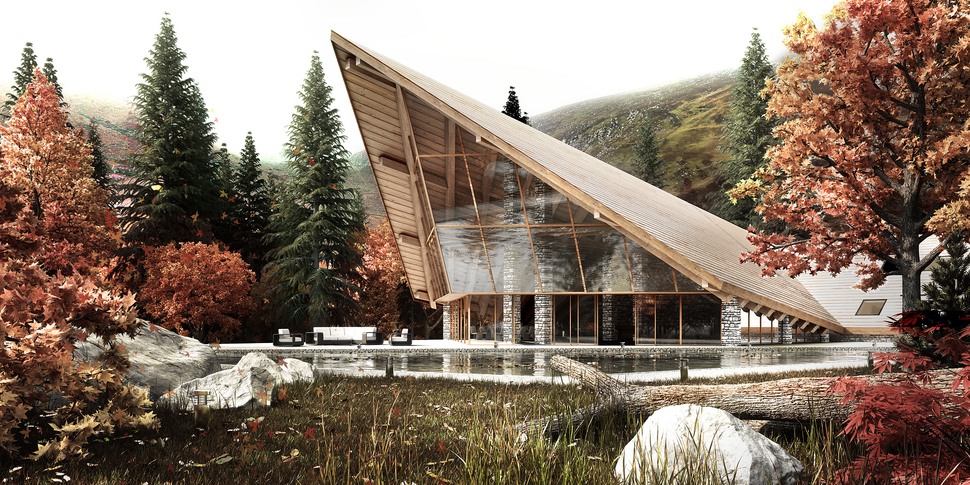
JL House - Fall
You must be logged in to post a comment. Login here.

Bobby Parker
Report Abuse
looks nice. The light, in the bottom left, took my attention for awhile. Generally, my rule of thumb is, if they ask "what is it?" you need to get rid of it.

Arun mudaliar
Report Abuse
excellent work,only one comment i have on this . the rock in foreground looks too whitish . more contrast i feel would give another dimension.

Abdullah
Report Abuse
leaves and trees are looking larger than normal.
RB Cameron
Report Abuse
Nice Design! Nice render!