Looking for honest critique
You must be logged in to post a comment. Login here.
G
Girish D Joshi
Report Abuse
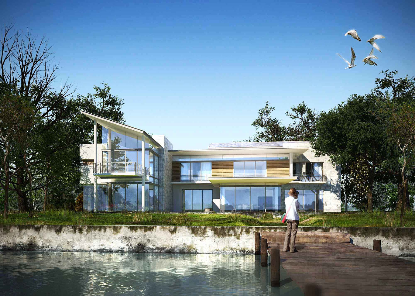
Nice render. For me the top 3/4 part of the image is nice other than the birds. The human, the water, wall, the wood bride / walkway could have been better.
t
tristan basco
Report Abuse
Thanks all for the comments, looking at it now I would have given the same comments. Amazing how things change when looking at it from a fresh perspective. The glass does looks too bluish. I initially had the person facing the house then realise the shadows were on the opposite direction, so just lazily flipped it. The environment does not complement the house, I'll revisit this when I have the time. I have been using the birds over and over, just realised I don't have many in my library.
J
JosephAHaddad
Report Abuse
In general it is very nice but few comments: first glass to blue, second the deck is to thin, and finally the birds which are becoming very popular among all perspectives! be more creative!!
Beautiful!! Good job overall!

Dave Buckley
Report Abuse
apart from what has already been said, lose the blur right at bottom right, it looks like a freshly printed photo thats been smudged, and it's just not needed with it being so minimal, it's not adding anything for me
would be interested know what's 3d or 2d
other than that it's good

paul rodham
Report Abuse
i would add that the building and landscape are in conflict with each other.
on one hand you have a nice clean modern house, but on the other hand you have a very poorly maintained, dirty looking landscape.
i think i'd put a little more design effort into the exterior environment, although i suspect you are enjoying working with the textures and plants the way they are.
i'd ditch the birds and the person as well - they aren't helping the composition at all. but again i think you're probably just testing ideas.
E
Elamos
Report Abuse
Nice image!!

marius erasmus
Report Abuse
Agree with heni30. That wall might just be to much. The angle of that roof on the left also might be to much. But great looking render and design. Would be nice to see some patio stuff, it just seems very dead by the house, it lacks some homely environment.
m
mcfetrmatt
Report Abuse
I agree with Heni30, it's hard to know what to focus on.

Athanasios Karampitsakos
Report Abuse
Very nice.
g
george sandoval
Report Abuse
In a drawing or a photograph, you can move your center of interest by increasing contrast; your eye goes to the area of greatest contrast regardless of the subject matter. Right now the most contrast is on the wall. The water stains/moss against the white wall are really too much. I would kill the contrast and move in closer to give your design the attention it deserves.

Thomas Cowling
Report Abuse
[COLOR=Navy]The birds look a bit manic, I would take them out. And the person taking the photo should be inverted to face the other way - at the moment they are focussed on the right of the building, which feels wrong.
Also the glass is too blue, I would make it darker personally as it will make the image a lot more realistic.
[/COLOR]
D
Dimas Sarabia
Report Abuse
It looks great for me

