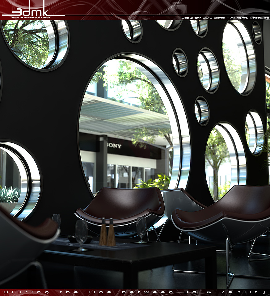
Cafe Interior
You must be logged in to post a comment. Login here.

Luis Cardoso
Report Abuse
Hi,
The image is great. You did a really nice work.
Like the contrast an like the dof, i would just over-expose the back (exterior) a bit.
Don't appreciate headers and footers on images. i think it attracts your eyes out off the image.
Well done.
M
Margus Muru
Report Abuse
Great design. I really like the windows!
3
3DMK
Report Abuse
Well Roberts...aren't you full of happy beans today!!
Is there a point to all this??? If so then you may want to re-do your post as I don't really see any point yet? Other than to be negative for the sake of it.
Cheers
R
Roberts Wrong
Report Abuse
your website only has 1 image and you have a website advertising your services?
image's not bad but its not really much of a shot for a "cafe"
C
Chris MacDonald
Report Abuse
I disagree with the people that don't like the depth of field, I think it's great. I too go for "realistic" DOF values as I'm used to shooting on a dSLR. One thing I would (personally) have done though is up the exposure a little, I know it'd result in blown out exterior but I think it'd be worth it just to show off the interior that little bit more.
However, that said; still a superb shot.
Y
Yhya Mohamed
Report Abuse
really nice design & material
m
marwan s
Report Abuse
the lighting, the colors, the design, the shot, and the rendering (including DOF) are superb! oh and imo it s not dark at all...
3
3DMK
Report Abuse
lazyness!!
I also did this a little while ago when I didn't really do any post....probably because I didn't know how....
I do a bit of post on my images these days...especially now I render to 32bit images.
Cheers
Timothy Back
Report Abuse
Very nice indeed Jamie any reason for not doing some post?
3
3DMK
Report Abuse
Thanks for all the comments everyone!! I appreciate the negative as much as the positive so don't be afraid to say what you think!
Regarding the DOF
The image was produced using Vray physical camera - with real world SLR camera settings, so that the blurring produced by the Camera depth of field is physically correct and natural looking. If you were to place a real-world SLR camera in exactly the same position with exactly the same settings you would get exactly the same blurring as in this render. [thanks to the brilliant coders at VRay]
It may look unnatural to some people after comparing it to so many CGI renders that are faked using a Z-depth buffer, thus producing a certain style of un-natural blurring. please be aware that I am not against this type of artistic DOF, it's just that I was looking for a physically correct result, to enhance the photorealism of the render.
Regarding the darkness
I agree that it is probably a little too dark! thanks for those comments!
materials [Jason Matthews]
The material on the circular window frames is a simple VRay material with a diffuse Value of about 60 and reflection value of about 140. The specular highlights are also anisotropic to of value of 8.5. which is what causes the streaking effect.
thanks again all for your comments!
Cheers

Jason Matthews
Report Abuse
Very nice. While I admit I am a little destracted by the foreground blurring, I more destracted by the metal window material. It is beautiful! Can you post your material settings for it?
r
ralf kirsch
Report Abuse
Image , Idea, Materials and modeling are great. Probably its my lack of knowledge about photography but near DOF and fare DOF in the same image for me is definitiv too much. Only the back area blured would be perfect. IMO. RK
3
3DMK
Report Abuse
The reason it's blured is because it has Vray Physical Camera - DOF......the way it would in a real life camera
Cheers

Athanasios Karampitsakos
Report Abuse
The lighting has dark problem and the environment that is visible from the windows are a little blurred.