Please some feedback on tone & color...
You must be logged in to post a comment. Login here.

CHRISTOPHER RODRIGO
Report Abuse
soften your shadows but the composition is nice..

Jane Namenye
Report Abuse
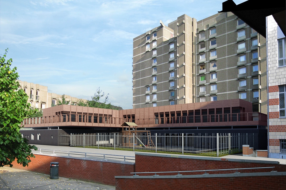
What I see is the brick wall in front of the scene is stronger in color (darker and more saturated) than the redwood. This could make the wood look dull in comparison, even if it is the right color by itself. Maybe getting closer so there isn't so much brick would help.

Antoine Desjardins
Report Abuse
That's looking waaaay better. Cheers m8
T
Tom Hamelrijckx
Report Abuse
I'm at this stage now. Still doesn't look nifty enough for me.
Any thoughts?
r
ralf kirsch
Report Abuse
Made some postwork experiment. Yuor material lacks the red value in the reflection color box. You probably make it reflect a gray value, which is not fisically correct. Try it out. RK
T
Tom Hamelrijckx
Report Abuse
Thanks Ralf, wil try that
This is where I'm at aftyer today's work, still not convincing...
[ATTACH]39570[/ATTACH]
r
ralf kirsch
Report Abuse
Well , just the color of your wood in the shadow zone is a little bit washed out in comparison to the reference. Did you try to give this wood material a fresnel reflection with IOR value about 1,8. By the way what render are you using Vray? RK
T
Tom Hamelrijckx
Report Abuse
Thanks Neil, I'm doing just that. :-)
Some specific critics needed though...

neil poppleton
Report Abuse
Tweak and adjust within photoshop post rendering.