Modern Kitchen
You must be logged in to post a comment. Login here.

Amir Mohebbi Sefat
Report Abuse
+
Amir Mohebbi Sefat
Report Abuse
++++++++++
G
Girish D Joshi
Report Abuse
Better :). I think there are lot of objects throwing around reflection. If you reduce some of that I think you have nailed it.
Regarding your best render till yet, I think it should be the last complete one your posted. It was superb.

CHRISTOPHER RODRIGO
Report Abuse
very nice design concept the same output what inxa observed.

Bradley DeWald
Report Abuse
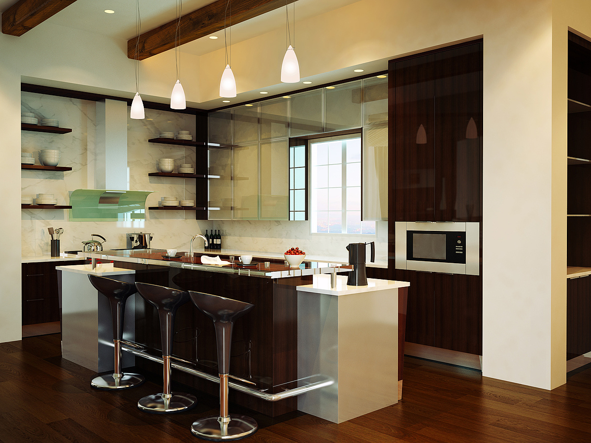
I have updated the image. I've made a few changes, but the main change was made to the wood color. This more accurately reflects the actual color of the wood that was used on the jobsite. Changes to the actual design of the kitchen will have to wait until I get the client's version done. What does everybody think of this one?

Jonathan Sanchez
Report Abuse
bradly.. another fine image as usual... definitely not your best, but it's great to see that you are improving your "Artificial" Lighting, and not just the natural light coming from windows as usual. Couple things I would improve:
-Outside Image
-Wood Texture above Microwave has a "tile" line
-That huge espresso maker, I would just remove it.

paul rodham
Report Abuse
the window has too much of a 'country' style to it, but more importantly the frame (or depth) seems very thin.
i vote to ditch the coffee pot.
Bradley DeWald
Report Abuse
Thanks for all the comments. Please keep them coming!
On the design front--I did not design this kitchen, nor any of the others that I render. I am given materials and blueprints and my job is to get it as close to photorealistic as I can.
Due to the dark colors in the kitchen, I was forced to let some light in behind camera. This light is blowing out the stainless end panels on the island and is making them appear white. Since everybody seems to agree it is distracting, I'll try and let some light in on another side that won't cause those reflections or that level of glare.
The frosted glass upper cabinets really do have an almost mirror-like glass on them -- I'm actually looking at them in person right now and you literally cannot see a thing that is inside of them. Nevertheless, I'll tone down the reflections a bit.
It is a very odd design detail to have the sink on the island instead of under the window, but now that the rendering is complete, perhaps I can move the sink to that location for a personal version.
A couple more questions: 1) Is there too much "stuff" or not enough "stuff" in the scene? 2) What kind of window would be better?
S
Steve Dalson
Report Abuse
Hi braddewald,
you may wish to consider the followings:
a. too many items on the countertops (either the front or rear). If you wish to take the front counter as the highlight of your rendering, the background items can be reduced so that the viewer can lock on your intention.
b. the front countertop maybe sufficient for 3-seater, however you can reduce 1 no. of stool to create better viewing experience. Which the kitchen area will get much bigger as we may not want to give the viewer a feeling that the coutertop is very small.
c. in term of design and effectiveness as a Kitchen, you may wish to revise the shelving design on the wall surface above the hob. As Kitchen requires storages more than displays.
d. it is alright to use wood veneer for a modern Kitchen. However, you can try to use other species of wood that can evoke the modernism of your concept. and, if the flooring and ceiling are of wood's family, it is encourage to source for alternative finishing for the cabinets.
e. just curious what is the type of material used on side & bottom face of upper cabinet around the window opening. is it mirror?
Regards,
Soft

Frances Gainer Davey
Report Abuse
For what it's worth, I really like this render. I agree with Inxa and Think3D to a point - the white cabinet on the end is indistinct. I love the wood and I think the pendants are as they ought to be.
paul rodham
Report Abuse
i'm not comparing it to any others - i think it's a fine image.
my eye keeps going to the window - it looks a bit thin and not very modern. i'm a little surprised not to see the sink placed there as well, but that's design for you.
i would add a bit more transparency, or maybe some lights inside the glass cabinets and show some things in there. the reflection on this glass is too glossy, and is very distracting.
Bradley DeWald
Report Abuse
That is certainly disconcerting to hear as I thought that this rendering was going to be/is one of my best to date. I have since changed the coffee pot to black and those are stainless steel ends on the island. What does everybody else think? Not up to par? What could I do to make this scene great?

Athanasios Karampitsakos
Report Abuse
I agree with Inxa.
G
Girish D Joshi
Report Abuse
Not the typical greatness that your kitchen renders have. Sorry !
Looks a bit plain. Specially the metal jug and the white base below look odd to me. Not a fan of the wood use as well. The hanging lights should have more details into it rather just white everywhere. Overall it needs to be a bit brighter as well.