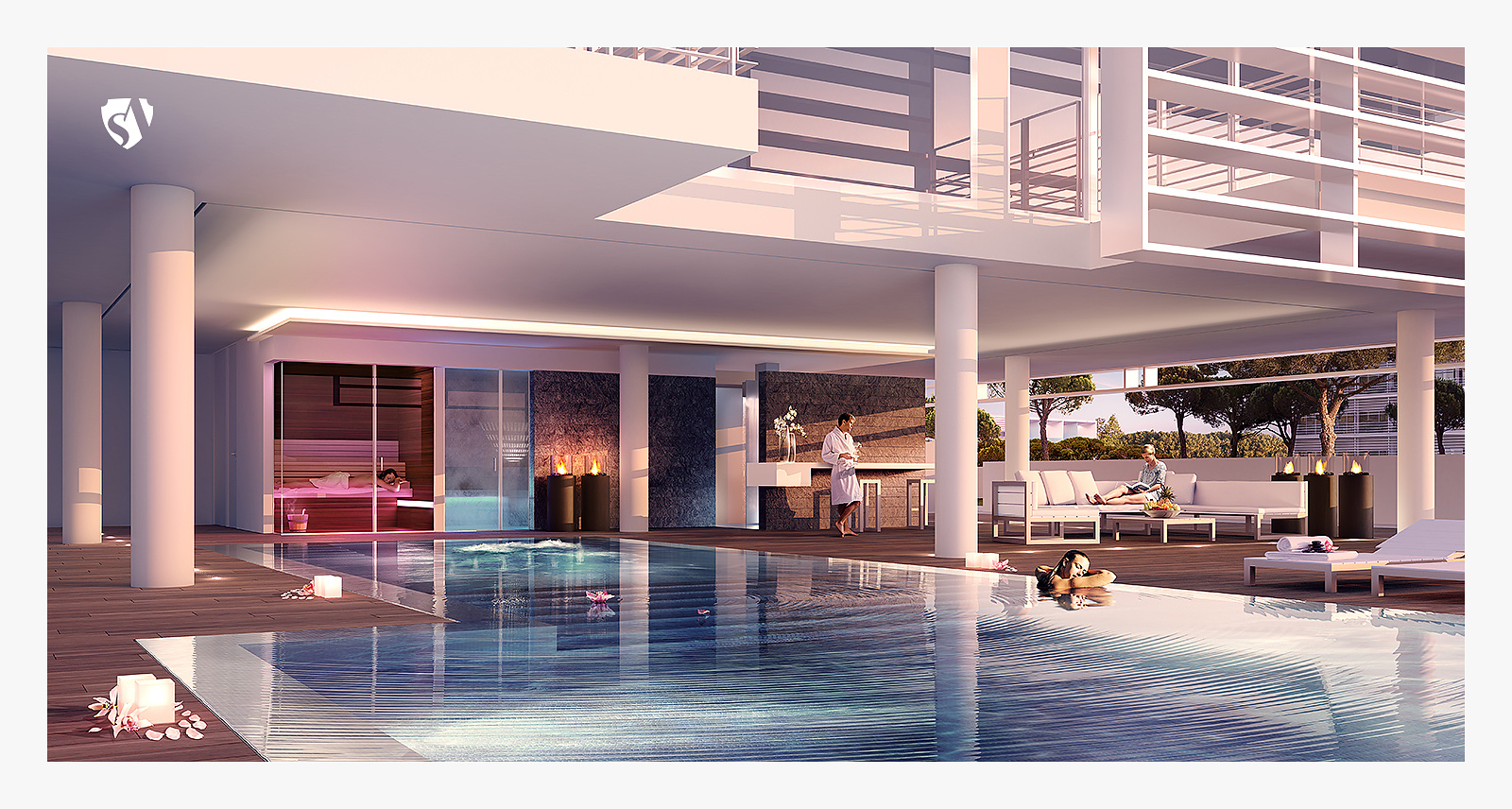
The Beach Houses SPA - Richard Meier & Partners
You must be logged in to post a comment. Login here.
John Dollus
Report Abuse
hmm..well, since you didn't design it, i'll spare the design commentary. The people in the background look very well balanced and natural - nice job. The guy in the water, though, seems awkward to me and i think it's mainly due to the shadow levels on him. In theory, he's more in full sun in a highly reflective environment than the guy standing back oggling to woman but the guy in the foreground has more shadow. The shadows of the lounges next to him seem inconsistent as well.

Roberto De Rose
Report Abuse
Hi Neko! Thanks for your critics, we had some costrictions for the image like the angle of the shoot or the wood floor material. For the water (it runs into a channels all around the pool), I know that it's impossible to understand how it works with a low res image so I link a crop of the high res.
And at last, there's no garbage :D There're some candles, flowers and petals...
[ATTACH=CONFIG]38979[/ATTACH]
Cheers!
Rob.

paul rodham
Report Abuse
couple of things stand out for me.
firstly it is not the most flattering angle to show off the building (or the pool area for that matter). the underside of the floor is a pretty dull aspect of any richard meier masterpiece.
secondly, the pool edge just doesn't look right. the wood deck appears to have no depth, and the water is exactly at the same level (it looks like it might flood the floor).
otherwise nice image.
edit: who left all the bags of garbage along the edge of the pool ?