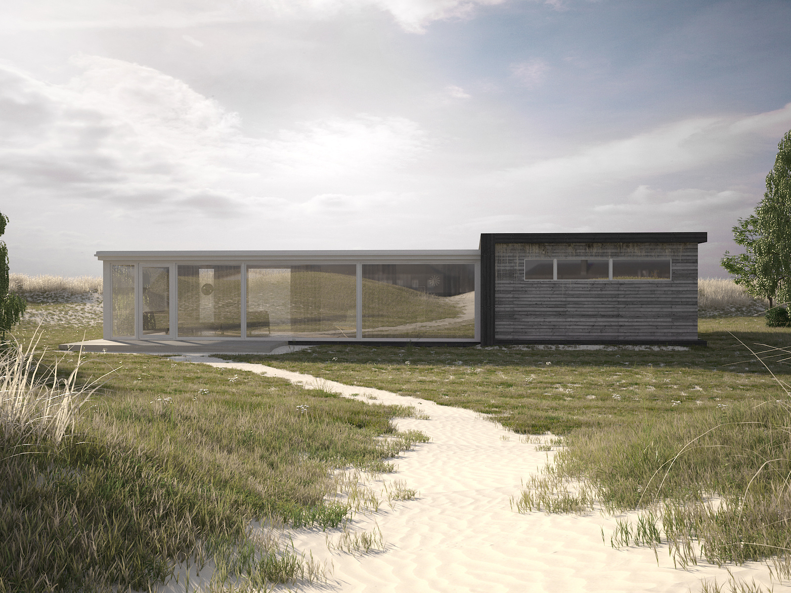
Square House Beach House Adaptation
You must be logged in to post a comment. Login here.

Metro Cúbico Digital
Report Abuse
This is great work, very realistic, but i am surprised you haven´t mentioned Peter Guthrie´s reference since it´s so very much alike is Sail house work project here: http://www.peterguthrie.net/visualisation/sail/
No?
Great job anyway. As a con I would just had a bit of contrast maybe.
Cheers
P
Paulo Martinez
Report Abuse
awesome
D
Derek Dallas
Report Abuse
Image looking great!
I have to ask, what did u use to create the grass?
Itoo Forest?
Cheers
Derek

Tom Day
Report Abuse
Here is an updated image with re-done vegetation. I used probability maps extensively with the terrain to give a more diverse feel.
What could I add to the environment to make it more interesting?
Tom.
www.FourDimensions.co.uk

Abdullah
Report Abuse
Brian Campbell
You did a great job in photoshop. And also I would like to thank you for your advice and sharing your knowledge.
I benefited from your comment. constructive argument.
I would send you a buck if I could. :D
Anyway, what is your rate per hour?
AB
Tom Day
Report Abuse
Thanks for your help, these are things that I know but I'm one of those people who just fails to do these things of the top of their head! Thanks so much for the pointer it's just opened up a whole load of interesting options.
Thanks alot!
Tom
www.FourDimensions.co.uk

Brian Campbell
Report Abuse
There are several things that can be done to improve an image. I would look to Photography, and the concepts used to enhance a photo. Such as:
Rule of thrids ( http://en.wikipedia.org/wiki/Rule_of_thirds ) Originally your building was set in the dead center of the image, where as if you align importent features that the viewer should pay attention to along a thrid line, it will help increase the interest of the over all image.
or Fibnocci Composition ( http://www.digital-photography-school.com/divine-composition-with-fibonaccis-ratio-the-rule-of-thirds-on-steroids ) another concept of aligning objects within your frame to increase interest.
Color Theory - Helps direct the viewers eye to a certain feature or area that the architect/client wants to convey strongly. Right now your rendering has a wash of red over the entire image, use cool/warm gradients to help look into and scan across the image.
Entourage - Using people to look at, point towards or walk towards/to will also help direct the viewers eye
Thats a decent start, basic and fundamental but these principles will help any image improve interest.
Cheers
Tom Day
Report Abuse
What would you suggest on the composition side of things? Thats sadly my week spot!
Brian Campbell
Report Abuse
[ATTACH=CONFIG]43899[/ATTACH]
Its a good rendering, with some good potential. With some curve love, and some adjustment on compostition you'd be pretty set. I took a couple minutes and applied said things...
Tom Day
Report Abuse
Thanks for all the pointers so far guys, I'm at my desk working away on it (rendering as I type) - First of, yes I'll definitely add more to the interior... I'm so early on in the project I haven't really had much time on that but that's on the to-do list. I did add some contrast with the curve but it just seemed to take away more than it added. However! I didnt think at all to adjust the red curve. I'll give that a go next time around. And yes, the long dry grass isnt great at all, I totally agree with you. I'm going to re-model that all to get a much more realistic resuly, hopefully then it'll actually start contributing to the image!
Thanks so far guys! Really helpful!
Tom
www.FourDimensions.co.uk - Freelance artist for hire.

Aubrey Millard
Report Abuse
Love the lighting and the grass/sand. Well done.
The only thing I think detracts from this image is that brown grass on the right side of the image.
The green color on the longer green grass clumps look a little over saturated too, but that could just be my bad eyes.
Good Job Tom.
Brian Campbell
Report Abuse
Curve adjustments could be done on the Luminosity,or possibly a gamma correction (lacks contrast), as well a curve adjustment specifically within the red channel.
Abdullah
Report Abuse
The render is extremely realistic. Ground work is more than perfect. No Critic I guess. But only issue is "the interior has less furniture"