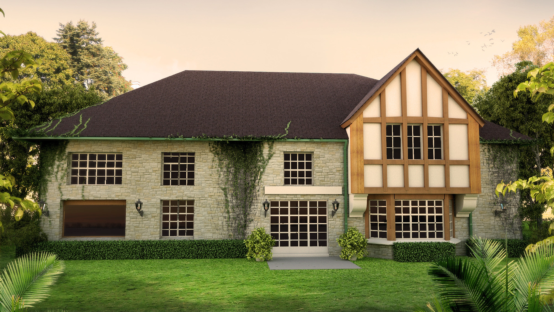
Villa Gainza Paz
You must be logged in to post a comment. Login here.
M
Matias Moretti
Report Abuse
Hi!, very nice render! Are you a newbie? or this is your first post? Yep i know it's weird writing English when we both are from the same country ahaahah.
Anyway, the only thing i'm asking for is: how about a bump or displacement map? I mean it for the walls.
I think maybe that would give you a more realistic surface.
Altought I like it very much
A
Alex Ayuso
Report Abuse
Looks really nice there! Since you have a beautiful day on the rendering... just as an idea, put something right outside that middle window, where you have some concrete, it seems bare and empty and almost seems like an unfinished driveway, until you look at the left and find that there is the real garage. Otherwise, all I can say is that I wished my first few renders would have looked like yours! Congrats!

Antoine Desjardins
Report Abuse
Looking much better in terms of mateirals. I'd lower that cam (as mentioned).
A
Antaiwan Wilson
Report Abuse
Is it possible to change the angle and bring it down to the horizon a bit? I think you change angles because of the change in depth on the facade. Can hardly notice this detail especially since the roof doesn't follow.
D
Damian Pereira
Report Abuse
Hey guys. ibeen working on details that you mention and others that consider will give the render better look (background, daylight,) and spend some (a lot really...) time to add an old rusty look to the materials. reflection: it really put the model in another level. Everything that you said is absolute right. I will post one last render with some other details, like furniture, knobs...
hope you like the progress!
Thanks Wrender youve been really really helpful... as a newbie, think need more time to see those big detail that make the difference between good/regular (like this) and pro.
best regards!

Ryan Watson
Report Abuse
First, I'm surprised you're brand new to the 3d scene - already looking good.
Some comments:
1. Some areas of your model don't make sense to me. The window on the left doesn't have a frame like the others - what is this supposed to be? Also, not sure if this is the back or front of the house. Are those doors leading out onto the patio area? Might add some details there (doorknobs) and also some life out on the patio like outdoor furniture, planters, concrete edgework, etc. Lastly, the bar above the doors - not sure what this is?
2. I'd remove the foreground plants that look like palms. They don't match the house's aesthetic.
3. The ivy looks good, but implies that the house is old. That's fine, but to further the old feeling, I would grunge up the brick and shingles slightly. Not enough to make it look decrepit, but enough to show that it's "lived in". Also, the wood looks a little too fresh and bright when juxtaposed against the ivy and stone. I'd think it would be more weather worn and sun baked.
Just some small stuff to take into consideration.
D
Damian Pereira
Report Abuse
hey Jon, thanks for comment and suggest! will post again with your observation... :)
Jon Rashid
Report Abuse
Hi
Nice render. Perhaps some subtle reflection on windows and some sort of interior curtain or detail to stop the windows looking like dead holes.