Kitchen
You must be logged in to post a comment. Login here.
A
Arshad Khan
Report Abuse
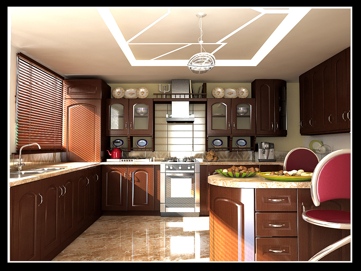
I would comment more on the rendering than the technical aspects of the kitchen ^^..I like the light throwing in,but maybe you should increase the bump a bit on the furniture,the textures are hard to distinguish (the lower cabinets on the left),but overall its good,and beware of the excessive light on the top left,on the stove and on the floor. ;)

Kevin Manus
Report Abuse
The corner cabinet near the window would probably not be built into a kitchen like that. It would be hard to open/access, and the top smaller cabinet would be impossible to access. Either lose it completely, or replace it with a corner cabinet (that faces out diagonally.) A possibility would be a cabinet with an appliance garage underneath. Same thing with the back right corner, you wouldn't put an end cabinet there, you would put a corner cabinet. You should also consider adding top trim that reaches the ceiling above all the wall cabinets since they all almost reach the ceiling anyways.
I don't understand the ceiling lights... is it lights built into the ceiling in a pattern? Something like that would be more appropriate in a more modern kitchen. same with the chairs and the chandelier, they seem out of place with the style of the rest of the kitchen.
The surface of the cabinets looks too plastic-ey. Add a very subtle bump map, and maybe some reflection and glossy maps as well. The back-splash would normally go all the way around the kitchen as well.