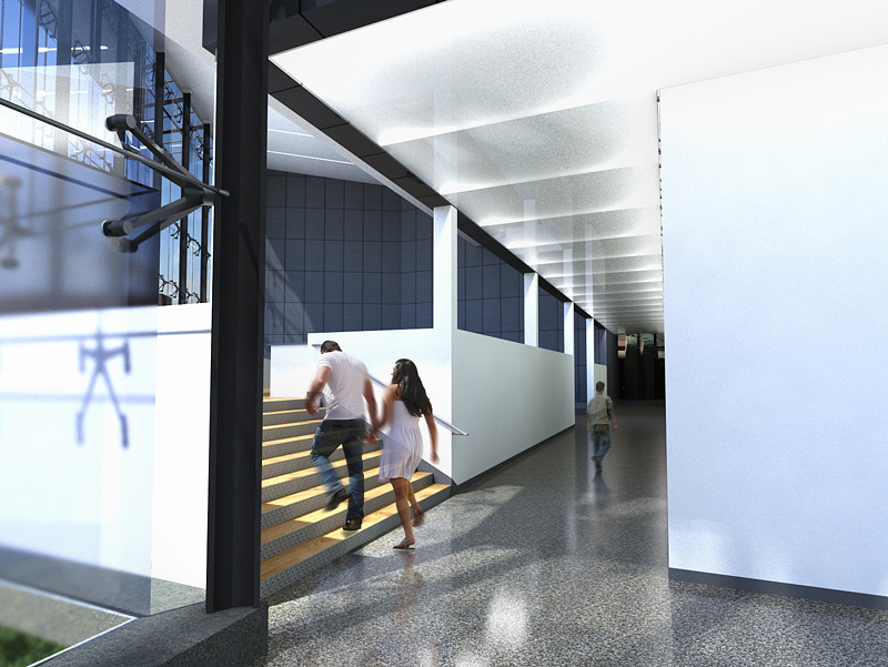
my first (good/successful) render
You must be logged in to post a comment. Login here.
J
Jeff Burtt
Report Abuse
ah thanks Jeff, you're right. Looks much better with some perspective tweaking in photoshop. I will definietly keep this in mind for future images, thanks a lot. I wouldn't say this is my "first" rendering. I've been working on this project on and off for a year, with hundreds of test renders, but this is the first one I've produced that is close to what I'm looking for in the final result and I felt in order to improve I needed to get the input of others. So far so good.

Jeff Mottle
Report Abuse
Like this.

Jeff Mottle
Report Abuse
With the current composition you need to straighten the verticals. Right now it feels like they are tipping over. In most cases it's standard practice in architectural illustrations to remove converging verticals, especially in interiors.

Marlon Giron
Report Abuse
if this is your first one wow! this is pretty good!
J
Jeff Burtt
Report Abuse
Thanks for the great advice. Pretty much agree on all points. As far as the highlights being blown out, I'm working in Gamma 2.2, so I think maybe I need to tweak my exposure control and the intensity of the lights behind the frosted glass. I had to crank those lights way up to have the effect I was going for.

Stephen Leworthy
Report Abuse
and the peeps have no shadows
D
David Arbogast
Report Abuse
Congrats on your progress with Max and MR! Some suggestions:
1. Move the camera so it is not aligned with the corridor wall on the right. Your rendering has it looking right down the edge of that wall and that is compositionally unpleasing.
2. Think about what you want as your rendering's focal point (composition). The most interesting thing in the rendering is the stair, so maybe move the camera in a position to better focus on that. If you need to do a corridor shot to convey design-intent, then maybe you do a couple of shots; a stair rendering and a corridor rendering.
3. The end of the corridor is dark/near-black. It needs to be illuminated well.
4. The glazing hardware brackets would look a lot better if it was stainless steel rather than gunmetal, but that's just my design opinion.
5. Your highlights in the ceiling an walls are being blown out, while the dark parts of the image are really dark. This looks like a symptom of not using a "linear workflow".
6. The materiality of the stair looks confused (different material on treads and risers). If it is a wood stair, I think it would have an improved appearance if the risers were also wood. Conversely, if it's a terrazzo stair, then make the treads that as well.
7. The guy walking down the corridor appears to be too small (out of scale).
I hope some or all of these suggestions are helpful. Looking forward to your other views!

