Inner West Home
You must be logged in to post a comment. Login here.

Aubrey Millard
Report Abuse
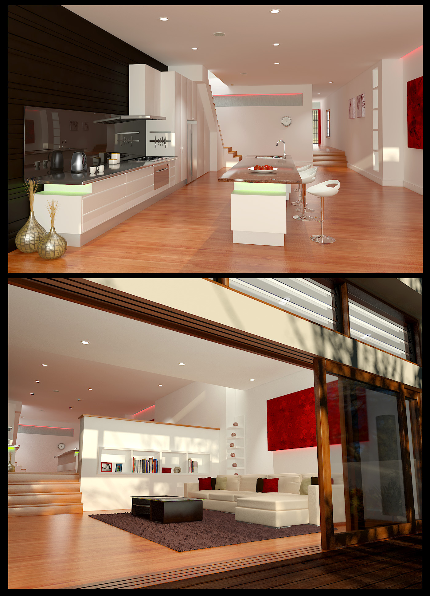
The lighting looks a lot better now, not as harsh. The reflections on the floor look spot on.
The black wall in the kitchen looks to saturated and it's so dark I can't tell if it's supposed to be a flat wall or cupboards.
Regardless it's a big improvement.
D
Darren Buesnel
Report Abuse
Hi AubreyM,
Updated my renders finally after your comments. If you have a chance please have a look and let me know what you think.
Darren.
D
Darren Buesnel
Report Abuse
Thanks AubreyM,
Really appreciate you taking the time to give me some feedback, and i totally agree with all you comments. I think i might have been just trying to be to subtle with some of the reflections and bumps and i dont think there coming through enough on the final image. It really isn't 'poping' like you say. I think that might be also due to my colour mapping choice. I rendered using adaptive DMC with min3 and max6 but used the Mitchell-Netravali not the Catmul-Rom AA so i will give that a go. Had a look at adjusting the image in PS but wasn't getting anything better from the image, shall try again.
Thanks again, will try some adjustments. Cheers.
Aubrey Millard
Report Abuse
Nice start.
I like the modeling and design. Some of the edges on the counters and walls are a little to sharp though.
Where it needs improvement is in the lighting and some materials.
For example the light coming down the stairs is burning out on the wall, it's to bright.
A lot of the materials lack reflection and texture (bump).
I think that a part of it is possibly your render settings. If not already try a render with adaptive DMC and Catmul-Rom AA filter.
A few adjustment in PS would help to make the image "pop" :)