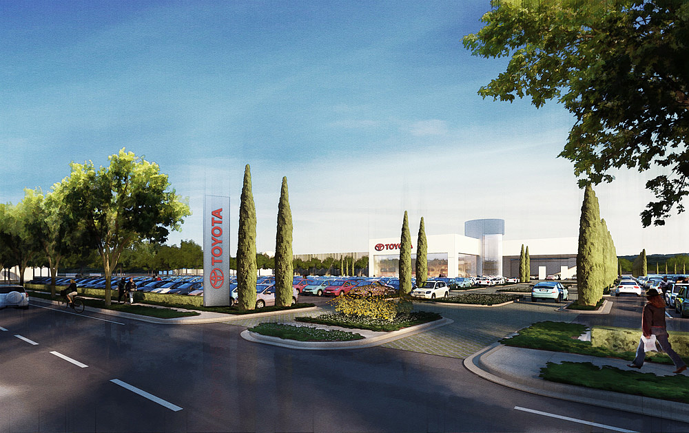
Auto Mall
You must be logged in to post a comment. Login here.

Infostudio
Report Abuse
Hi Travis,
I really like the style used. Also the first aerial image. But in the image on the street, I personally would never put the sun behind the camera. It is one of the first rules I explained to my students. Because that does not give depth to the graphics and become flat. Moreover, the shadows cast by the vegetation on the road a bit mislead.
Greetings.

Jonathan Sanchez
Report Abuse
Thanks for the explanation Travis... can't wait to try it out myself. Great idea for the Design Development stage!

Athanasios Karampitsakos
Report Abuse
I like it sketched!
Gilbert Leon
Report Abuse
I like your use of people walking, cars moving in and out of the lot, that alone gives life to the image.
G
Girish D Joshi
Report Abuse
Oh yeah Ernest. Completely forgot about his post. Thanks for putting in the link as well.

Travis Schmiesing
Report Abuse
I can post the raw render tomorrow when I am back in the office. As for animations... you should check Ernest Burden's work. He authored this style, and has shared the techniques on methods on the forum for other to learn from. He has done many animations using it. http://www.acmedigital.com/
I personally have not tried it for animations, but may at some point in the not so distant future.
The style is really effective because removes the need for everything to be completely thought out and perfect. It frees the viewers mind because they do not lock into errors in photorealism, or get trapped into thinking the project is complete, and can not be changed.
Thanks. The aerial is built on top of a Google Map of the site. The buildings are simple outlines traced from that image, and the trees are placed according to where the were in the 2d image. I then went back and cleaned up the site texture by Photoshopping out most of the trees that went over the road and buildings. I think this really helped pop the streets and parking lots. It is an extra level of TLC that I think helped a lot.
I agree on the street level. The didn't say anything about the sign (yet.) The client was the developer/city and and not the actual dealership so that may be the reason it has not been a concern. it is actually good that we are not close to the building because nothing has been designed other than saying we need a building here, and one here, parking here, etc...
Sancheuz,
Check Ernest's posts for linework techniques.
To give it a quick summary I duplicated the layer, the run the find edges filter, then desaturate that, and set the layer transfer mode to overlay. Then launch level, and drop the white from 255 to 140 or so. If you set the white to 128 (half of 255) then it should not effect the brightness of the image at all. It will just add the linework.
As for less detail moving away from the center of the image... You need away of simplifying the image. There are plugins for this, but you can do it in Photoshop by using Smart Blur, or Paint Daubs, or anyhting that removes detail, and blends color. Do this a couple of times to varying levels. Layer the least detailed one on top, and erase the areas you want more detail in.
I would do the image simplifying before you do the linework. I think it looks better this way. In the end it is really salt and pepper to taste.
Low plantings are 3d, trees and Italian Cypress's are 2d.
Thanks Tom. The blue hues are rendered in. The sun is a direct light, with a Vray sky set as the environemnt background. When the radius of the direct light fades off, the blues from the Vray Sky take over.

Tom Livings
Report Abuse
Very nice. I like the blue hues.
Jonathan Sanchez
Report Abuse
Nice Work Travis... any comments on the method for the NPR look?... the shrubs, are they 3d or 2d? As for comments, I myself don't like the road reflections, it's a bit distracting.
Matt McDonald
Report Abuse
I really like the aerial shot. It feels loose enough to be "conceptual" but the low sun angle, and all the nice shadows give it a fairly sophisticated feel that you don't normally see in that kind of shot. Did you model the whole thing?
The street view shot sort of is what it is with a big building at the other side of what is in essence a giant parking lot. My only real comment is based on my experience working for corporate clients...they tend to get annoyed when you hide (or in this case partially hide) their main building signage.
G
Girish D Joshi
Report Abuse
The feel of it is very nice. I would like to see the original render as well if it's possible for you to post it.
Personally, I think the reflections look pretty nice in such a style
Quick question - Can this style be used for animations as well.