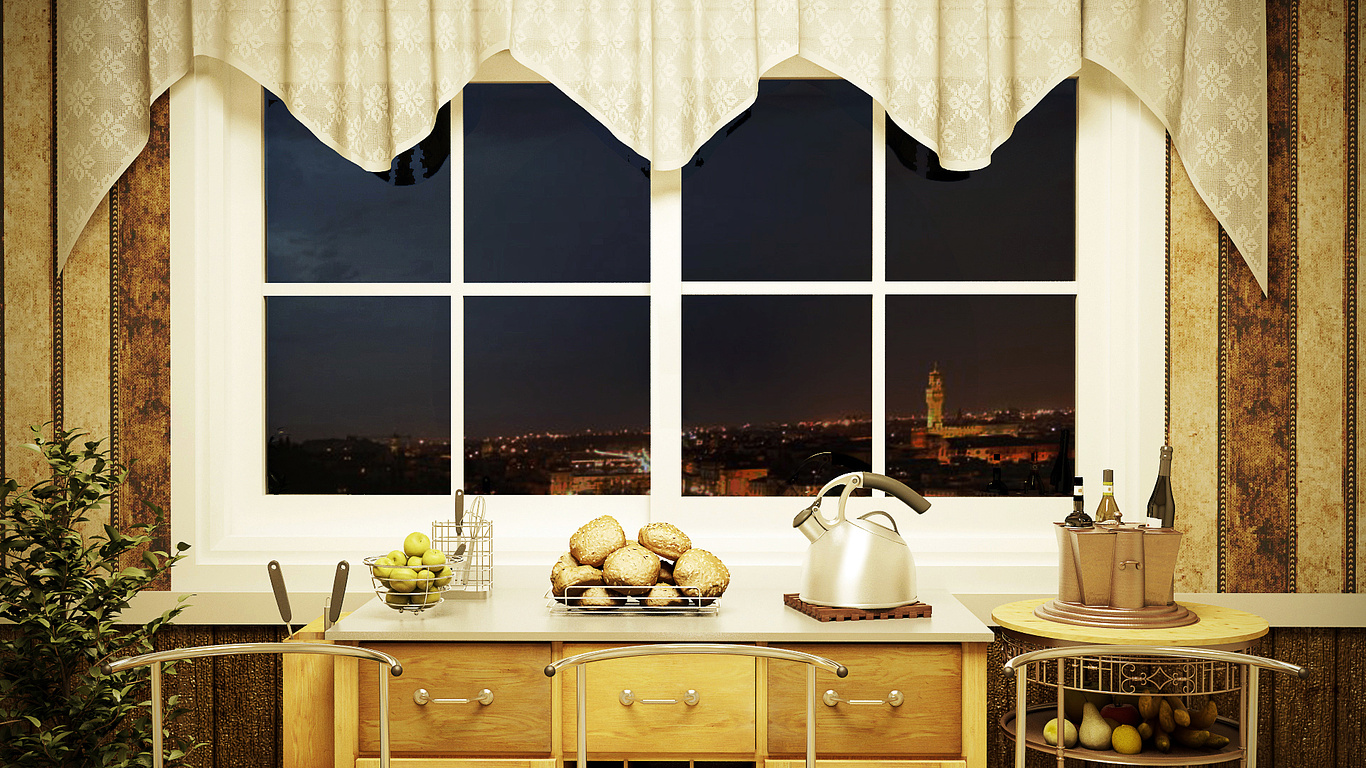
Fun Kitchen
You must be logged in to post a comment. Login here.

Torquato
Report Abuse
Many thanks for coments... This image for fun, so more fun scene, but next imagens i have more correct.
Sorry my english.

Travis Schmiesing
Report Abuse
I'm not as picky about the horizon, it is not an uncommon for the horizon to be at that level in SF.
I think the image has scale issues. I feel the window frame is thick and the window shape / mullion proportions are off for a traditional influenced detail and textures of the interior. The tea kettle is also large compared to the basket of fruit on the far left.
I haven't decided how I feel about the depth of the image. It is very flat, but at the same time, the flatness feels kind of fresh.
I agree that the image frame needs rethought. Right now the image is more about the horizon and view out the window than it is about the kitchen.
Along with the composition of the frame, the composition of the elements on the counter is a bit stale also. The items are more or less equally spaced on the counter. Bunching some of the items together, and layering them will add interest.
I wouldn't mind seeing another layer out the window either. It will help inform what floor this room is on. Right now I feel I am on the 4th floor in a hilly city, but I am not sure. Maybe the top of a tree outside the window, a foreground rooftop, or something along those lines. If this room is on the first floor, then the view out the window needs more work to feel like a first floor. I am not sure whether that is working in low level plants, or revisiting the horizon.
Anyway, welcome to the message board.

Tom Livings
Report Abuse
Great work! But Ric's right, you need to level the horizon.

Ricardo EloyVanguard
Report Abuse
A bit too bright and strong on constrast, imo... and your horizon is wrong. ;-)

Athanasios Karampitsakos
Report Abuse
Nice but you have to shoot a more wide camera from behind in order to catch more items and details

