Boostdanmark Project!!
You must be logged in to post a comment. Login here.

Orlando Toro
Report Abuse
Thanks :) I agree.
g
george sandoval
Report Abuse
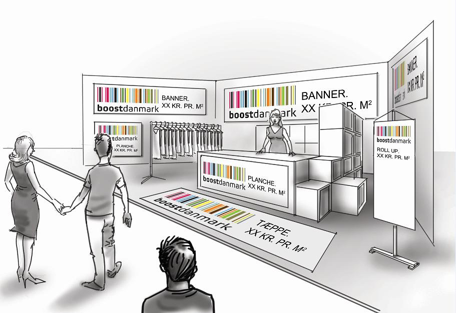
Your work is showing everything nicely but the design is so bland!
Their logo is bands of color yet the the back walls are a white background for a white logo.
Even just making the walls black would improve everything. And the floor looks residential
and old fashioned. It could be this is what the client wants but you could find a million
examples online to show them that their display could be vastly improved.

Naeim Noorollahi
Report Abuse
nice work.