Mall - School Project
You must be logged in to post a comment. Login here.
C
Charles Black
Report Abuse
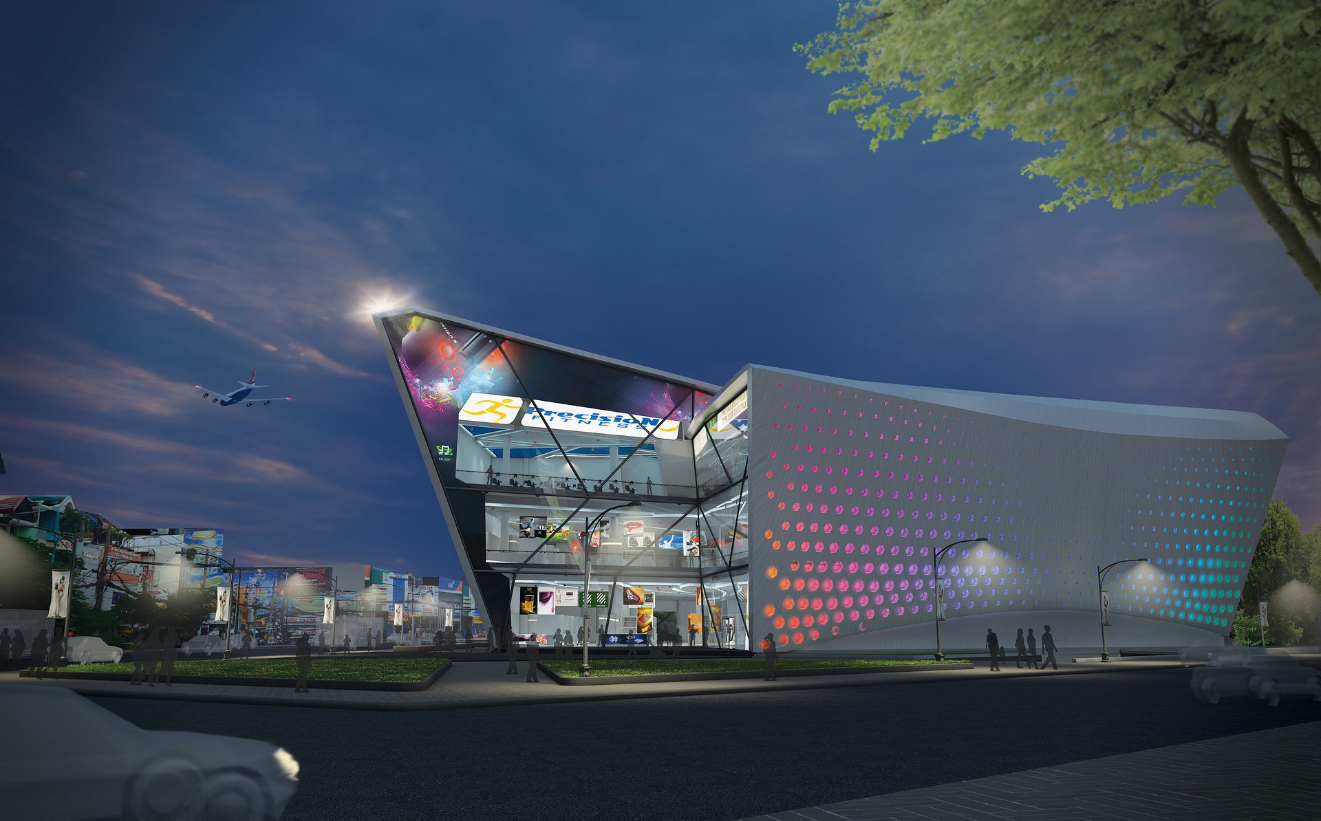
I like the improvement, the building already pops out much better, but I think it would look better and more natural if you would have chosen a sky image that has those necessary qualities on its own instead of just vignetting the last image. Now it seems that there is too much blue air space above the building. Try experimenting with different kinds of sky images that have a more interesting hue variation. The tree in the right side of the building does not look right. It seems that it is illuminated from above by the sun but that doesn't work quite good in a night shot, does it? Try to darken the upper part of the tree so only the lower part would seem to be illuminated by the street lights and give a blue tint to the darker parts, because that's the kind of light that is coming from the sky.
K
Khoi Hoang
Report Abuse
Thank you for all your advice! I did not consider much but just put a lot of things into that. Now, throwing unwanted things away, it feels better :)
C
Charles Black
Report Abuse
The tree in the foreground looks bad. Try to find something that is higher resolution and better matches the lighting conditions. You could even try to use a tree silhouette for it. The total composition looks kid of bland. If I were you I'd change the sky image to something that gradually lightens up towards the bottom left corner, so that the eye would be drawn more towards the left diagonal facade.
K
Khoi Hoang
Report Abuse
Thank you ^^, i just deleted and it looks better. Maybe next time I will put real car models into that, still dont no why I used semi transparent and lowpoly cars in the first place.
http://ne1.upanh.com/b5.s11.d2/faa1a2da25a6bfc533491c7d8d031fff_36581381.2.jpg
neil poppleton
Report Abuse
Lose the airplane, and lose or improve the car..to the bottom left corner.