Private -
Private
Max / Vray
Ive being trying to make this render of a uni project have some kind of wow factor. THe origional render out of vray seems to have too much contrast / saturation, it doesnt look natural. In trying to correct for this in photoshop the result looks to me a little 'forced' - in getting rid of the saturation the image seems to lack substance.
Im unising the vray sun, exponential colour mapping, ir map + light cache.
Any help is much appreciated.
I have attached both images.
D
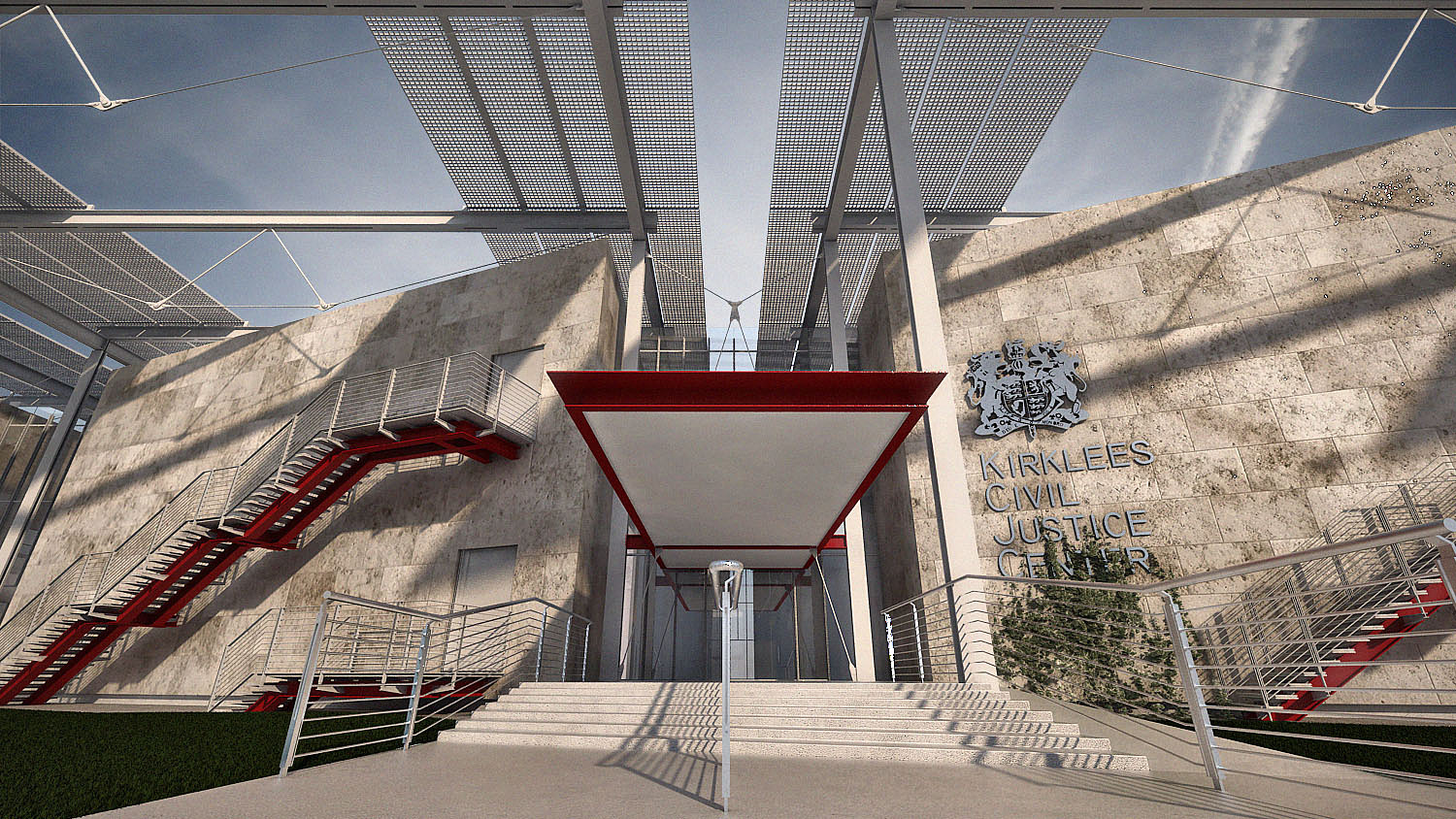
I hope you don't mind but I wanted to see what this image would look like with a bit more contrast. I know you were trying to decrease the amount of contrast and saturation but I think a bit more contrast helps to make this image pop more. E [ATTACH=CONFIG]41094[/ATTACH] [IMG]http://forums.cgarchitect.com/images/misc/pencil.png[/IMG]