"as it is"
You must be logged in to post a comment. Login here.

Michael J. Brown
Report Abuse
I like.
Yes, the windows could use drapes, and the glass could loose the black hue. Definately the material shading could be more defined. But overall, there's something about pulling a well modelled, well lit, well textrued model out of its context and plopping it down on a blank canvas.
This 'scale model' approach is refreshing to the eyes. And that is not to take anything away from scenes rendered with full contextual detail. I certainly would not want to see this approach taken often. But on occasion I do find it refreshingly simplistic.
I
Ivana Milosevic
Report Abuse
Thanks very much for the comments.
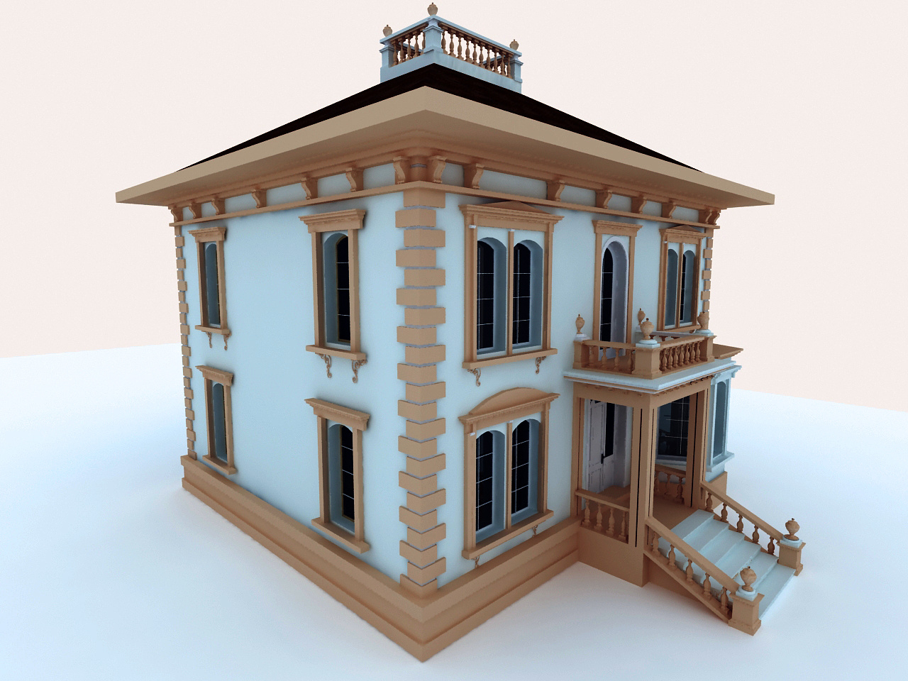
This was my first exterior modeling and rendering project, as it is the house now, after reconstruction, and the client asked me to model his house for documetation in the future!
Thanks very much for the comments, and
I will take the suggestions on the next project !

Antoine Desjardins
Report Abuse
Your view point is unnaturally high. It makes your architecture look like a scaled model. Try lowering the cam and adding at least 1 directional source.

Jason Matthews
Report Abuse
Nice detail and overall GI.
The materials could use some tweaking. I am not sure what is wood and what is plaster / stucco. Should those be wood steps or concrete?
Are you lighting with HDRI? The lighting seems a bit uniform and all the white areas only makes it seem uniform. Personally, I am not a fan of black glass. Can you add drapes or window treatments of some kind? As far as extra detail goes, take a look a the fascia and how the soffit intersects the fascia.