Another Living Room
You must be logged in to post a comment. Login here.
I
Ismael 1-1
Report Abuse
These last changes requested by the wife and she was also pleased with her choice.
I will go and see what else to try next. Thak you all for the critiques.
Larger, http://imageshack.us/photo/my-images/94/stripes6.jpg/
I
Ismael 1-1
Report Abuse
Thanks Fran and Juraj for the critiques. My wife did not like the orange either! She sugested green and the attached image is of the first green I came out with which she liked. I used a pattern displacement to add a bit of character if possible to the plain 'fabric' but concluded that it was too much and reduced it for the final image done with a camera rotation somewhat as Fran suggested.
Forgot these,
http://imageshack.us/photo/my-images/225/rev3nana3.jpg/
http://imageshack.us/photo/my-images/189/rev3nana.jpg/

Frances Gainer Davey
Report Abuse
Hi Juraj,
Orbit generally means to rotate the camera on the vertical axis. I think the couch on the left side would read better if more of its front was visible.
Here is a quick visual of what I mean:
[ATTACH=CONFIG]46431[/ATTACH] [ATTACH=CONFIG]46430[/ATTACH]

Juraj Talcik
Report Abuse
This is much better than first image, I like that the white is white now ;- ).
I like the rug also, but not the orange sofas, I think the colors now clash a bit, and the graphic pattern is a bit "grandma"ish. I would go for monochrome, either white,gray,etc... the rug would stand out more, and image would be more compact.
I don't understand Fran's camera angle, whether I am suggesting the same or exact opposite...but I would keep horizontal lines on image straight, I like the harmony such compositions bring. If you want to show more dynamic composition, then I would tilt it even more.
Frances Gainer Davey
Report Abuse
That's much better. I like the rug and the contrasting upholstery for the sofas.
I would play with the camera angle a bit. The sofa in the foreground might read better if you orbit the camera to the left, so that you see more of the front of the sofa.
I
Ismael 1-1
Report Abuse
Updated image and the pile-rug is looking good. Need some texturing proper but the image seems a lot better I think.
larger image (twice) the size. Also there was no post done on them. They are straight from th render.
http://imageshack.us/photo/my-images/542/fransfinalnopost.jpg/
I
Ismael 1-1
Report Abuse
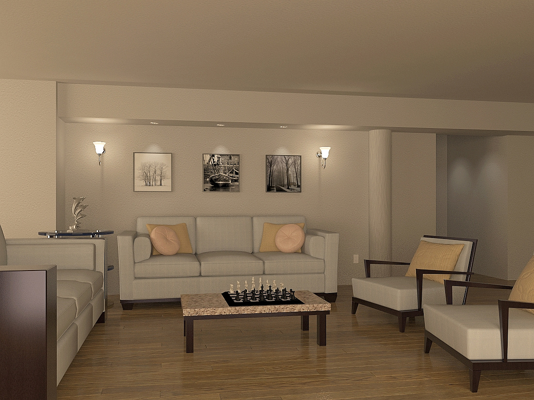
Reviewed the render and attaching the results. To increase the contrast I reduced the front light and increased the
East (left). Added a rug and decreased the UVW map of the walls and ceiling so the grain on the plaster texture would not appear as noise.
Too much compression on the uploaded image so:
http://imageshack.us/photo/my-images/36/rev11.jpg/
Re-rendered at twice the size for the final on these series, Thanks.
http://imageshack.us/photo/my-images/24/rev22a.jpg/
I
Ismael 1-1
Report Abuse
Fran,
Thanks for taking the time to comment. Truly the image is too evenly
lit and in need of contrast. The sofa on the left is the same as the
front except I wanted to make the sides out of wood and so, just
deleted some polys, added some boxes and chamfered a bit. The
end result is confusion as you noticed. The closest arm rest may pass
for all wood but the far away kept at least an inner lining of the old,
(may give someone an idea for a sofa design).
The seat cushions on the left sofa also have a monotonous deformation
which is perhaps hardly noticed on the other.
I very much admire your work and quote your insights as in the blog
"IES Lights Too Dark"; yet, I always find myself on the sideof those
needing advice. Will see about improving the image.
Regards,
Ismael
Frances Gainer Davey
Report Abuse
Hi Ismael,
A nice graphic loop-pile rug would give the image some punch and make the area more inviting. You could also increase the contrast a little to bring out the lighting. Are the sides of the sofas wooden? I would pay a little more attention to the detail there, with both the texture and the modeling.