Architectural Office in 500 sf
You must be logged in to post a comment. Login here.

Jeff Mottle
Report Abuse
Thomas, as I've already cleaned up and deleted some of your comments this post will not make a lot of sense to many, but if I ever see those types of comments on this forum again, you'll be permanently banned from this site. Grow up and act like a professional!

Frances Gainer Davey
Report Abuse
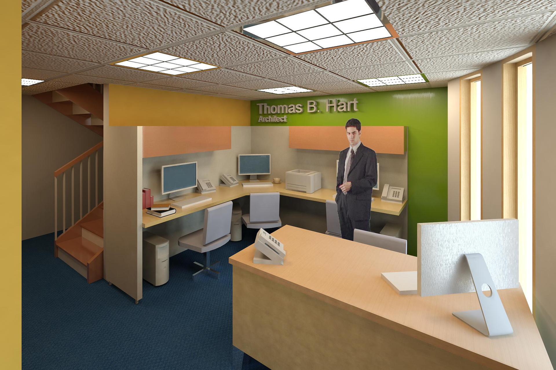
There is no reason for the wall behind the camera to be where it is. I often cheat them back in order to fit the camera in when camera clipping isn't an option. Try not to go lower than 35 mm on the camera lens length.
The man looks large relative to the rest of the scene. I would leave him out since the chairs will establish scale for the viewer. The bump mapping is way too heavy on the ceiling tiles. Add some lighting in the stair well.
R
Riad Abi Chahla
Report Abuse
Table, chair, car, ceiling height and bump map to ceiling tiles are all out of proportions with the rest of the shot... use better modeled keyboard and LCDs ...

Travis Schmiesing
Report Abuse
Here is the advice I give to beginners in arch viz...
Build and light your virtual models as though they were physical scale models. This will help isolate the important elements needed to produce a good rendering, and it will get you away from red cars, matted people, and bad textures.
______
Try building and rendering a model that has the same level of detail as the scale model that you posted. I don't mean texture it with cardboard or anything like that, you can leave it one material for the most part. Just build that level of detail, and light it in a way that you would a scale model.
What this will do is to remove several of the details that come into rendering, and remove the urge to try and perfect the real world. Instead is will allow you to focus on lighting, composition, and modeling. These are the most important elements in rendering.
Later you can work on texturing, materials, realistic entourage, and other real world anomollies. Just focus on the essentials that are needed to communicate an idea for now.

Ryan Watson
Report Abuse
Bad form. In both your modeling and comments.
Comments:
1. The bump map on your ACT is ridiculous.
2. The guy standing there looks like he's from the Twilight movies - pale, vampirish, out of character, and quite frankly, boring (just like the movie)
3. The lighting is flat - needs more ambient light from the outdoors to be realistic
4. Image is grainy - sharpen
5. Cabinets and furniture lack detail - clarity
6. Overall design is uninspired - but judging by the lettering on the wall I presume this is YOUR office. So I guess that makes sense that it would be boring and out of place.

Thomas Hart
Report Abuse
when you say proportions are you talking about the visual distortion on the right? How would i control the camera to get a full view of a small room without it looking like that? Any PRODUCTIVE criticism is appreciated. Please tell me how to correct anything you mention. This was my first rendering.
R
Riad Abi Chahla
Report Abuse
wow, thats not good...Bad proportions

Nic H
Report Abuse
looks pretty depressing.