2nd year architecture train station design
You must be logged in to post a comment. Login here.
m
mcfetrmatt
Report Abuse
Thanks Neko, you said some really good things
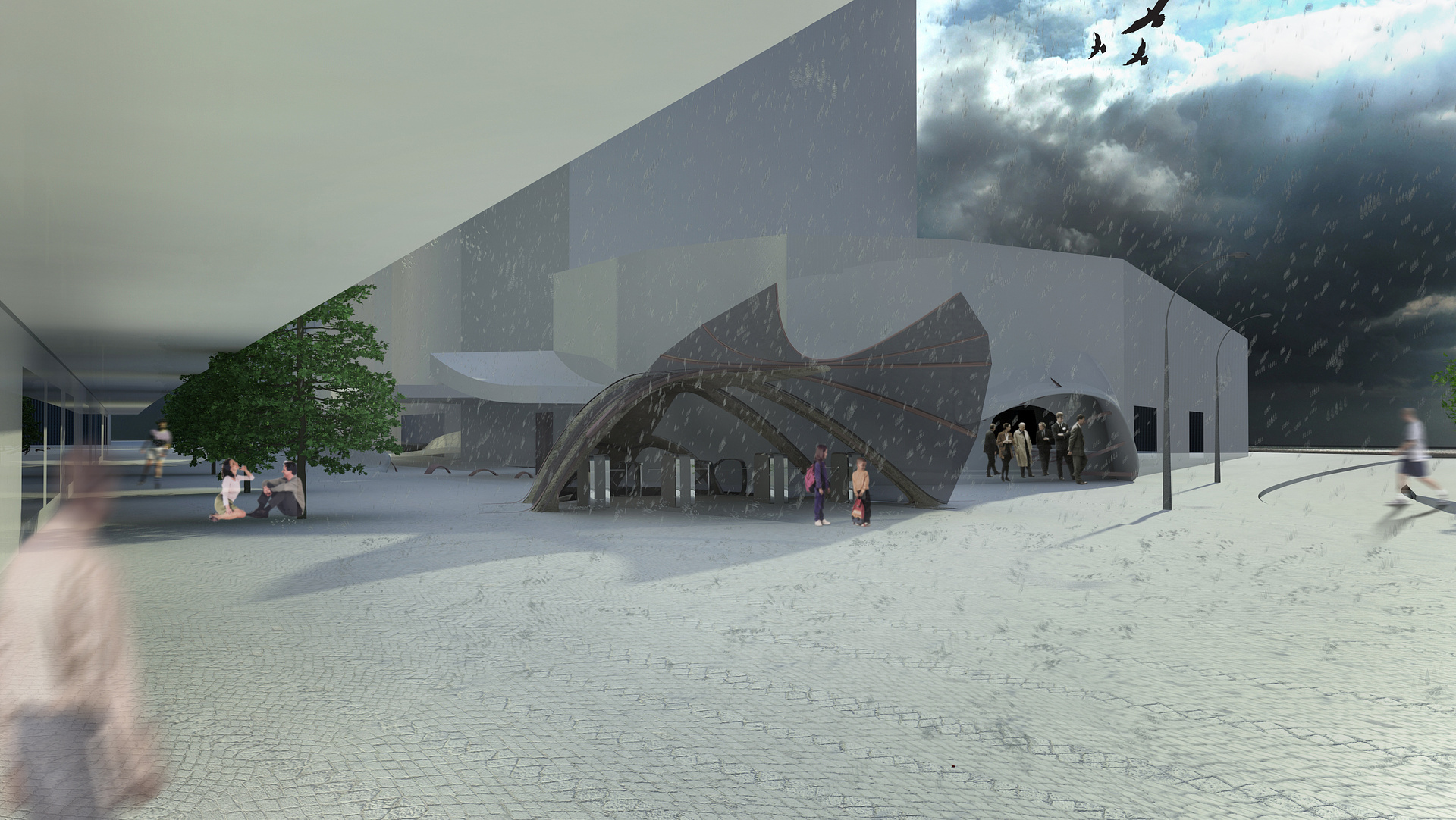
Unfortunatly half of the design at ground level is cut off by the trees... not too good. With these images I was trying to have a go at creating an image that creates an emotional response with the viewer, not just a plain render. Guess I've got plenty to work on.
What's your opinion on the people then? If they're needed for scale and habitation how can they be used so they do not destract from the architecture?
Any CG advice? The best way to learn is to have someone rip your work to pieces in my opinion haha.

paul rodham
Report Abuse
i'm going to ignore any CG advice for a minute, and just comment on the architecture.
i think you need to look at the image(s) carefully and ask yourself if you've communicated the design intent very well. in my opinion, it is impossible to understand the building in terms of materials and structure. the composition of the image (or the angle of the shot) does nothing to explain the space, and in fact seems quite dark and depressing. there's no warmth, there's no intrigue - it's lacking in detail.
i would also look to expand the design out into the courtyard/open space, which looks extremely empty or under-developed. add some interest other than a guy standing talking on a walkie-talkie with a hard hat in hand.
adding the people in the foreground looks more an attempt to fill space - they distract from the image, which should be more about the architecture.
hope this helps.