Studio Render (for Marketing Literature)
You must be logged in to post a comment. Login here.
r
r3nder
Report Abuse
Lol! Too True! So many FINALS :confused: I gets a little confusing at the best (worst) of times hehe...
I am still not 100% on the render though, attention to levels and lighting, think I will go over it again, I have a lot to learn!...
Looking forward to seeing some of your work Brodie! :D

Brodie Geers
Report Abuse
Haha, I suspect your naming convention may looks something like mine at the end of a project
Project Name 01.jpg
...
Project Name 08.jpg
...
Project Name Final 01.jpg
...
Project Name Final 04.jpg
...
Project Name Final 05 FINAL.jpg
Gotta love those last minute changes :)
-Brodie
r
r3nder
Report Abuse
[COLOR=Red]Edit: Uploaded Final Revised Render :rolleyes:
[/COLOR]
r
r3nder
Report Abuse
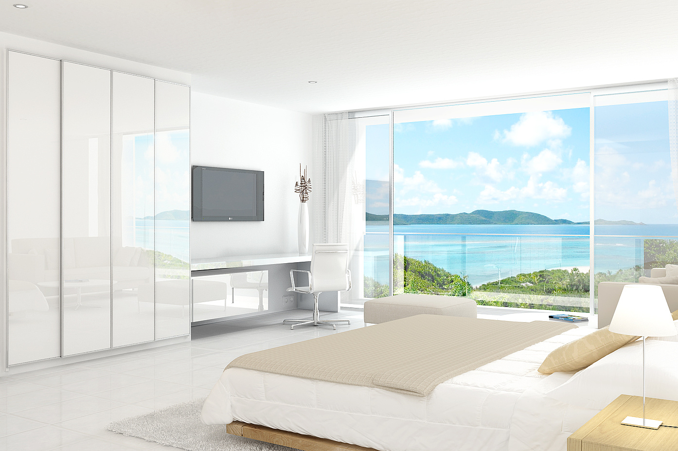
Thanks Brodie, yeah the original idea was for the Condo towers to be displayed on the t.v screen, but felt it somewhat distracting, I have had quite a lot of noise in this image, which I have managed to get rid of under the desk. I will be putting up a new final render soon, and will be glad to have finished the beast! :)
r
r3nder
Report Abuse
:o Thanks Brodie and Raylight for feedback - muchos appreciated! Revised version due later...
T
Tihomir Blazhev
Report Abuse
very nice keep posting
Brodie Geers
Report Abuse
aw, perfecto! That really did the trick. I think I like it better with the TV turned off too. I'm not sure if you just changed it in this render or one of the previous updates but it was a good change. It really helps to draw your eye around the room rather than focusing on the TV.
-Brodie
r
r3nder
Report Abuse
[COLOR=Red]Final Render Added[/COLOR]
Cheers Brodie, I've blended reflection onto the wardrobe/ desk work surface area, added a few extra elements as a final render. Thanks again for your advice!
Brodie Geers
Report Abuse
This one looks great. As someone mentioned, it may add a bit more color and realism if the reflection of the patio door that's visible in the wardrobe was reflecting the same image that's visible outside the patio door (reversed and toned down quite a bit of course, maybe even using a Screen blending mode or something). But that's a pretty picky detail for what the image is being used for.
Great job
-Brodie
r
r3nder
Report Abuse
[COLOR=DeepSkyBlue]Re-Render Uploaded 19/09[/COLOR]
Thanks for the comments and invaluable feedback, please can you post your comment on the re-render if poss? Thanks in adv for your feedback! ; )
r
r3nder
Report Abuse
Thanks for comments guys, I am re-rendering out a new scene and will post up when complete. ; )

Athanasios Karampitsakos
Report Abuse
I agree with Inxa and the backgound should reflect on the wardrobe's glass.
r
r3nder
Report Abuse
Thank you Brodie, Inxa, Tanni, Farzad - I have made some adjustments and re-rendered, but cheated a little as we have moved from the original design to a glass balcony space removing some of the chrome and rendered with a brighter crisper background. Please let me know what you guys think. Thanks in adv!

Farzad Firoozi
Report Abuse
Nice Modeling ...and Render! Very Good!

Tanvir siraj
Report Abuse
It need more contrast, foreground lights are brighter then background try to make it inverse.
G
Girish D Joshi
Report Abuse
Nice render.
Needs more contrast I think. The background looks odd. It should be more bright, plus I think the horizon level should be a bit lower.
Brodie Geers
Report Abuse
You've got a great render there. Very good for marketing literature, very bright and welcoming. Only suggestion I might make in terms of rendering would be the metal railing. The bright chrome works ok for the patio doors I think, but it seems too shiny and the edges seem to sharp for the balcony railing. It's also difficult to understand from that angle what the distance is between the patio doors and the railings. It looks like they're just on the other side of the doors as if perhaps there's no balcony at all.
-Brodie