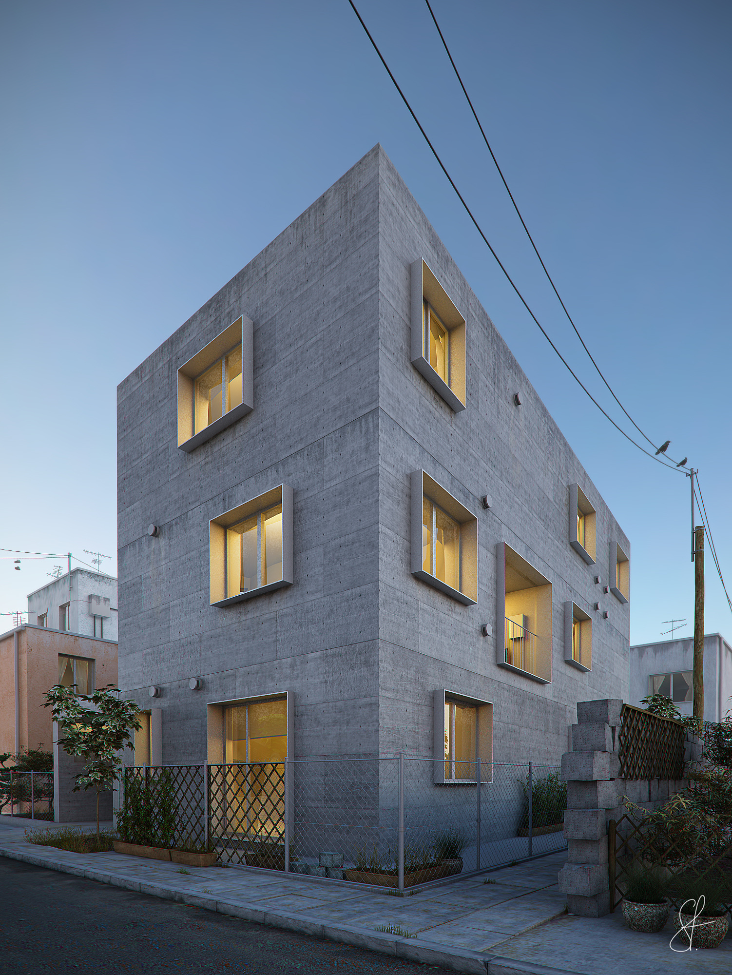
Yotsuya Tenera residential
You must be logged in to post a comment. Login here.
Viet Nguyen
Report Abuse
awesome rendering!

bartek stanczak
Report Abuse
Oh, yeah. Of course chromatic aberration :) I thought it was barely noticable. I'll take a closer look on the subject the next time. Thanks!

Pesquet Matthieu
Report Abuse
Chromatic aberration..
bartek stanczak
Report Abuse
Thanks for your comment mattPasquet. I'm not quite sure what CA stands for though ?:)
Pesquet Matthieu
Report Abuse
very nice lighting and color palette... great job !
maybe too much CA ;)
bartek stanczak
Report Abuse
again thanks for your comments people :)
Think3d: it is slightly dirty comparing to the raw render, I didnt want to exaggerate on this one. but on second thought maybe you're right :)
krimson 2580: The vertical lines were perfectly straight in the raw render, they got a little twisted after adding lens correction in PS but I think its only for the good :) thanks for pointing it out.
cheers

Wim Clissen
Report Abuse
very nice work indeed!
only remark is to adjust the perspective: straighten the vertical lines.
a
alkyon n/a
Report Abuse
well done!Nice lighting and texturing

Athanasios Karampitsakos
Report Abuse
Very nice image bartek. I could recommend to dirty a little the concrete material.

Antoine Desjardins
Report Abuse
amazingly well detailed render. great work.
bartek stanczak
Report Abuse
Thank you all for your comments ! I appreciate it.
D
David Arbogast
Report Abuse
Nice rendering! I like the building. The site elements (fencing, block wall, power poles/lines) detract from the nice architecture.

Stephane Vanaubel
Report Abuse
I like the warm/cold ambiance. Nice texturing too.
Great image. Congrats !
R
Robert Shelton
Report Abuse
Excellent work

Aubrey Millard
Report Abuse
Some nice texture work going on there. Good Job.

Abdullah
Report Abuse
Dont disagree like that, do you disagree that the 3d building is looking awesome? no!
then why have you said "Disagree enirely".
Anyway, Its art. and I may have objection on an specific thing that does not suit my liking but over all the image is great. :D
bartek stanczak
Report Abuse
thanks for the comments. I always try to do my best. If there is anything I could improve in my images please point it out :)
bartek stanczak
Report Abuse
thanks for the comments. I always try to do my best. If there is anything I could improve in my images please point it out :)
C
Chris MacDonald
Report Abuse
Disagree entirely.
The lighting is spot on, as is the design. Clean, simple, modern, nicely detailed.
Abdullah
Report Abuse
I dont like the yellow light is coming out of windows. background 3d buildings looking awesome.
but it looks like a cheap place. all need and poor people use to live there. ;)
nice stone work.