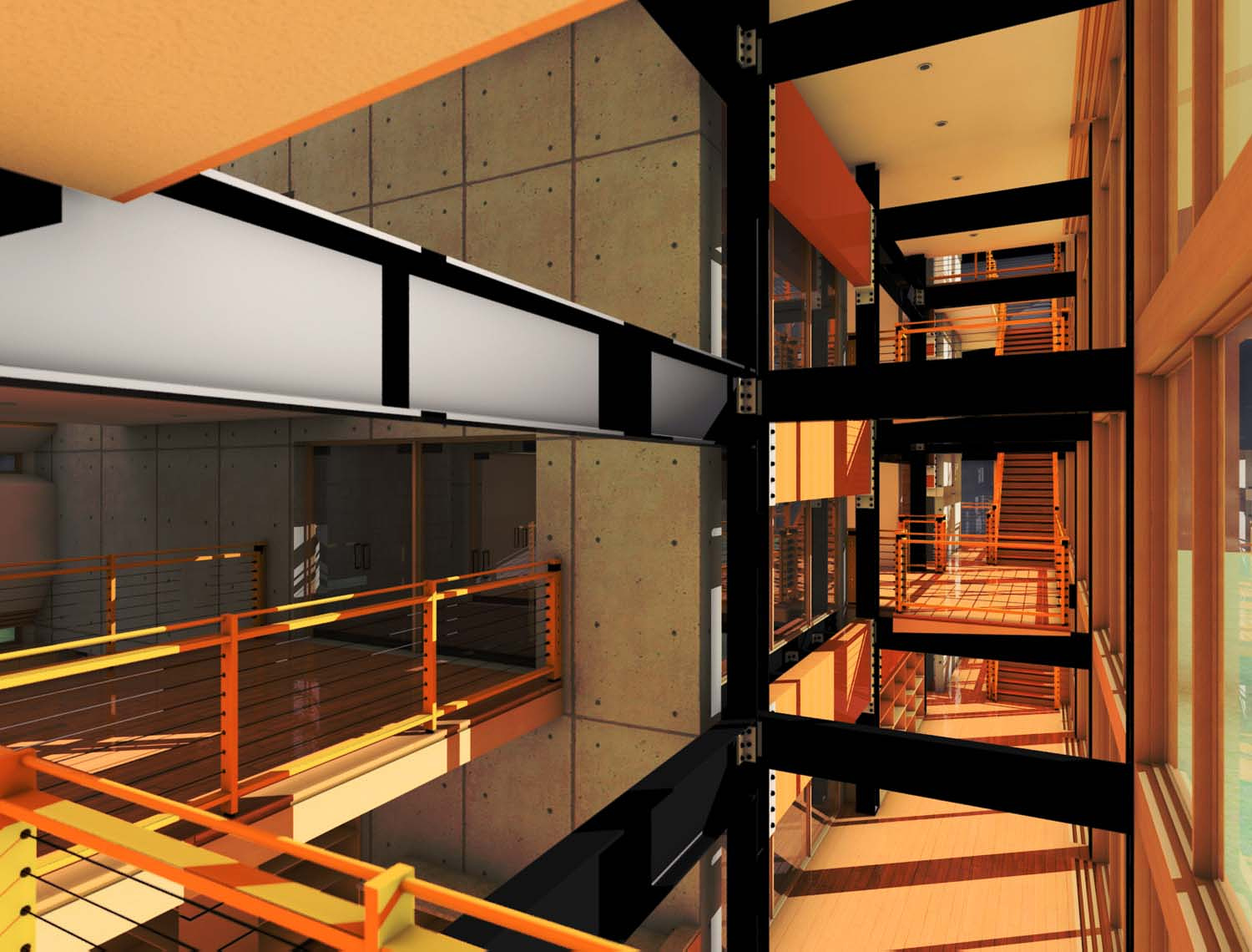
Mezzanine View
You must be logged in to post a comment. Login here.

padhia romaniello
Report Abuse
Typically in this type of design, the metal and concrete is left as it's natural color, which is a cool palette of gray and blues. this allows the emphasis to be on the geometry and the negative space without the distraction of your eye being drawn to a color. this could really work to your advantage, because you will notice in arch viz, the most powerful images are not all warm or all cool, they have a subtle warm to cool shift. so the lighting should be warm and in contrast to the cool interior. make the viewer feel the cool metal and the cool concrete in contrast to the warm sunlight coming through the windows.
A
Antaiwan Wilson
Report Abuse
What other colors should I try? I really wanted to go for a warm palette. Comfortable and easy on the eyes. I argee the yellow is definitely in question but sometimes I seem limited in color. I will try different lighting as I'm not fully finished adding fixtures. I have a night scene that I'm trying to pump out but too many lights.
Do you guys use rpc content when it comes to people?
I have much to do when it comes to furniture and accents! Hope to finish soon while I'm in the middle of another project.
Thanks for the compliments, they mean a lot!!
Antaiwan
Gilbert Leon
Report Abuse
One other thing you may want to consider is adding people to the image. However, be selective, add specific type of individuals (young, old, ethnic, urban...) Ask yourself what type of person will be living here? You created a great image, now give it some life.
padhia romaniello
Report Abuse
this is a fascinating space and the camera angle is great. does the metal have to be yellow and orange? this could be a beautiful image, but i think the colors, materials, and lighting kill it. the lighting should be much softer. i would recommend looking at photos of modern architecture, specifically scenes with similar materials. a couple trees outside the windows that cast subtle shadows would be nice. i think also if you could crop the image differently, so that is not square, have more of the image show at the top and maybe bottom, that would add some more depth to the composition. this could be a great image to do a couple versions of with different lighting, because it is so simple yet really striking. keep it up, you are almost there!

Justin Hunt
Report Abuse
it could be a FG smoothing issue. I think its filtering that does the smoothing, try setting it to 2.
Looking much better although the exposure bightness is too high.
A
Antaiwan Wilson
Report Abuse
Here is an update.
I used the settings that you suggested. I also put an occlusion map over the first pass.
I think it looks fine but now this weird blotchy shadow is showing up on the second level behind the railing.
I have a skylight about that area but not sure why the shadow looks like this.
I tried reducing the trace depth back to 5 but it looks like its there to stay.
I must have changed something else but unsure.
Still working......
Thanks for your help Justin and sorry for bring up old memories of the past! LOL
Antaiwan[IMG]http://i210.photobucket.com/albums/bb205/Akira329/Kitchen7-1.jpg[/IMG]
Justin Hunt
Report Abuse
things have changed (for the better)
For the sun,
turn off over shoot and make the hotspot size just large enough to cover the windows
For GI
Reduce the Max sampling radius, as a guide set it to 10% of the scene size or smaller. This is more relavant to the area of the model that is seen in the view, just incase the model is huge but your only looking at a small portion of it
30000 photons is too low, you may have to go up to 100000 or more to get good lighting detail
Try droping the Global Energy Multipier to 1, rather increase the exposure Physical scale or set the sun's photons to manual for more control
Increase the Max Depth to 10 (gets more light bounces)
For Exposure Control
Turn Off "Affect Indirect Only"
Play with the Physical Scale
Try hiding the glass elements when calculating the GI and FG, even though they are see through they still block some photons and you need every photon you can get.
As I said things have changed and its been a while since I used Max8 so I am going off memory, so take everything I said with a pinch of salt.
Keep us updated
jhv
A
Antaiwan Wilson
Report Abuse
These are my settings. Hope you can see the image.
Yeah I know, Max 8 is a dinosaur! lol Its hard to keep up with autodesk when they have an update every year!
Also I forgot to say that is a concrete wall with the form tie holes exposed.
[IMG]http://i210.photobucket.com/albums/bb205/Akira329/maxsettings.jpg[/IMG]
Justin Hunt
Report Abuse
can you post your render and exposure settings, I'll try and cast my mind back to Max8 days :0
A
Antaiwan Wilson
Report Abuse
I'm using mental ray with a daylight system.
I using Max 8 also
Justin Hunt
Report Abuse
what are you rendering with?
A
Antaiwan Wilson
Report Abuse
Thanks for the comments!
Should I make the light white? I'm not sure of the best setting. I would like for my white materials to show white without much color bleeding.
How do I do this?
Antaiwan
F
Frank Richarz
Report Abuse
Overall I think that the modeling is good. Your materials could use some work. Your concrete has the look and color of particle board. (If it's not concrete i appologise.) Also your lighting is heavy on the yellow side which I think may be causing your materials not to show correctly. Keep up the good work.