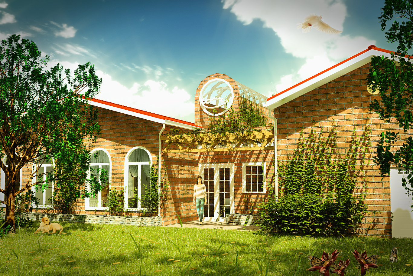
old house
You must be logged in to post a comment. Login here.

Ryan Watson
Report Abuse
Some comments:
1. The image appears way too color saturated and overexposed. Consider dialing this back about 142 notches.
2. Unless these are intended to be oversized bricks, they are far too large to be standard. It's throwing off the scale of the image in my opinion. Also, watch the mapping of the bricks on the arched portion. This needs to have bricks placed on the radius of the arch with a keystone of some sort, or just an entirely different material/map. Lastly, the skylight doesn't appear to have any glass in it - is this intentional? Consider increasing the reflections to get a sense of form.
3. The trees look like you've duplicated them on top of each other in photoshop. Gives it an unnatural look - probably just need to delete one of your layers that's stacking on top.
4. I would omit the bird - it's distracting and frankly, kind of weird.
Hope this helps!

