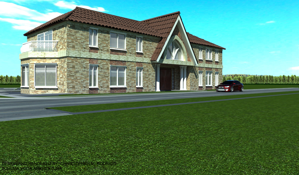
Revised backgorund
You must be logged in to post a comment. Login here.

Ryan Watson
Report Abuse
Serious composition issues here. Too much foreground, and the building oddly positioned.
The sky is WAY too saturated. The background trees are not convincing. Could use a lot more landscape/detail around the building.
Materials are lacking - lots of tiling and generally flat.
That's a start I suppose...
R
Riad Abi Chahla
Report Abuse
Architectural design is very bad, especially with proportions...Backgorund and foreground are bad... Stone texture is worse, roof tiles huge, your window glass looks plastic and the car model does not fit...
Rodrigo dude, even your Black signature is poor...
Don't revise anymore, start with everything from scratch
good luck