My Second!
You must be logged in to post a comment. Login here.
amin EDALATI
Report Abuse
you are very weak
ehsan khosravi esfarjani
Report Abuse
i like minimalism.

Love Chaurasia
Report Abuse
I like that dark area in ur render but in the first one if u could reduce the glow near the windows say by 30% i think it will be more close to reality.
overall very nicely done
Marcin Jastrzebski
Report Abuse
Very nice renderings, good light and overall mood!

perpetualpusher
Report Abuse
[IMG]http://img219.imageshack.us/img219/7273/dark2t.jpg[/IMG]
Uploaded with ImageShack.us
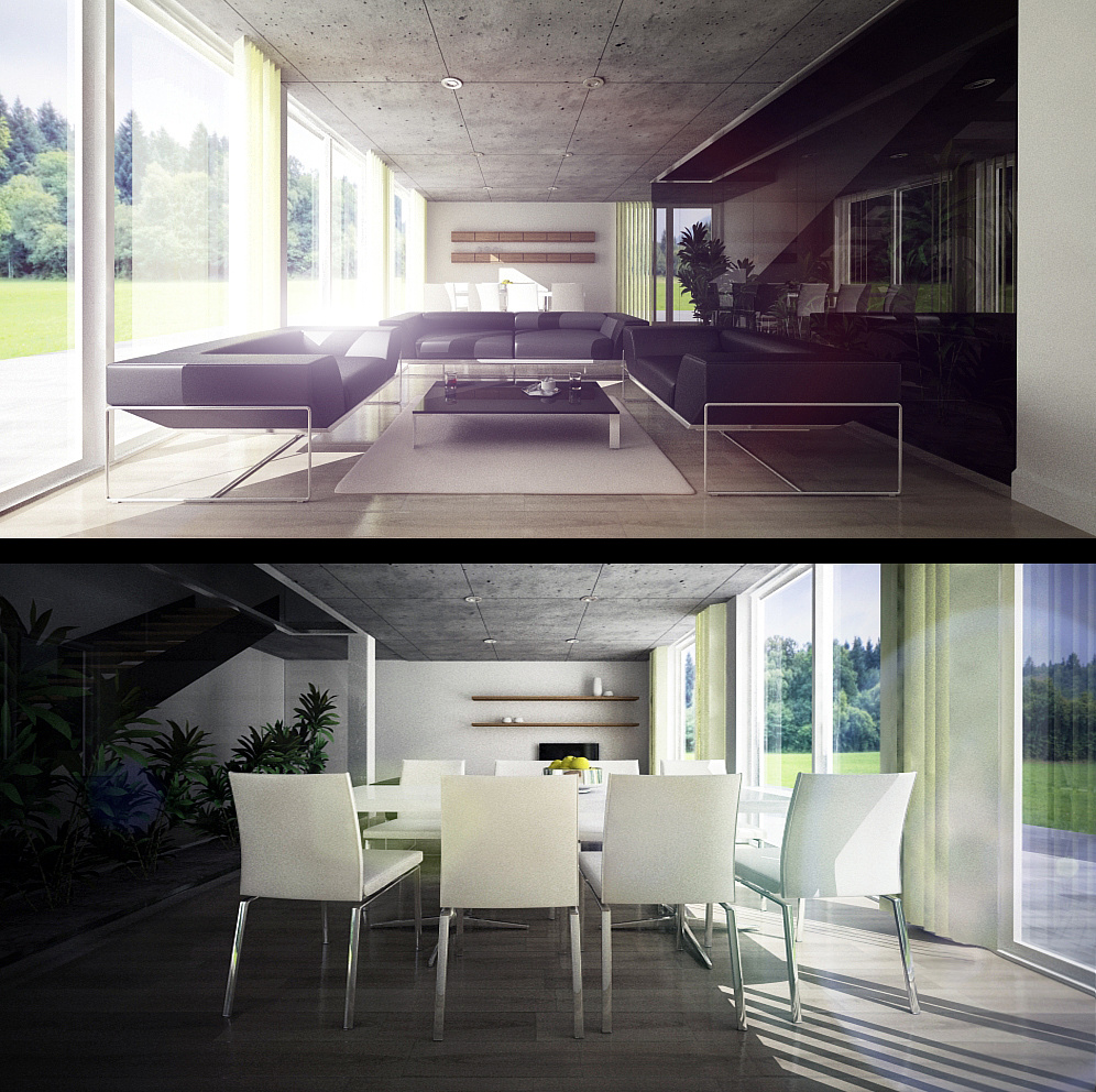
So this is the so-called "artificial lightning" scene..I'm having doubts that it's a little bit dark and gloomy.
The second one is a DOF experiment, the blur came out kinda noisy and not so good, so I did some corrections with photoshop...And again flares - it seams I can't hold myself when it comes to them :D

Farzad Firoozi
Report Abuse
Great Work.Nice Design!
perpetualpusher
Report Abuse
I am really thankful to all. It is a great boost indeed to recieve anykind of feedback!
And yeah, I prefer the contrast/drama more, because it tells a different story everytime. It reminds me of a music video/ movie scene, lol
"Nighty" render soon! :D

Antoine Desjardins
Report Abuse
Nice style. I actually like the effects employed in the initial render. If the intent was to create a high contrast/dramatic scene.. mission accomplished.

William Garcia
Report Abuse
Good work, each with its own style!
M
Michael Michaelides
Report Abuse
Hi There. No i am not the author of the architectural design. I did the visualization for the architect and the owner of the building according to my his description and my personal taste/style. One think i can recommend to you is this: freeze all furniture, plants, blinds etc. Leave just the walls slabs, windows and then do a test render. Post it if you want and i may be able to guide you on how to reduce the excessive contrast.
perpetualpusher
Report Abuse
Well I've never claimed that the i[U]nterior idea[/U] was originaly mine. A friend of mine showed HIS variation of this..so I thought I could do redo it in my own way. More important at this point were the light/material settings and the way the whole thing works. As for the primal idea, yes it is a great interior set (talking as an architect). And I think that publishing such materials as in general are a great way to teach people like me who are just getting started.
ps.
Mr. michaelidesm, are you the autor of the original idea?If so, glad to meet you! ;)
perpetualpusher
Report Abuse
Well I am truly happy to meet the autor of my inspiration. :D
M
Michael Michaelides
Report Abuse
Hi There. I have two images that i did while ago and they look very similar in concept. Maybe all arcitects drink from the same drinking well (ha,ha,ha).
perpetualpusher
Report Abuse
Thanks to both of you! Well, maybe it is a bit darker indeed..
I've made like 30 tests..hm maybe it's because I like a bit more gloomy interior scenes :D
The flares on the first piece are almost where they should be..but the on second one are more like.."here looks good!" ;)..Well..they are movable anyways, I was just testing. And about the learning ..well I had those basic interior settings once (too too basic) and I am trying to develop what I like. And it's the "try-fail" method :o
Right now I am testing the artificial lights...I will post a render maybe later. I have some weird shadow issue :confused: and it looks I could use some help
Thank you once again and cheers from Bulgaria!
m
marwan s
Report Abuse
they look good, same comment regarding lighting at some points looking dark. about the flares they look ok to me but i dont know if they r exact in this particular position of ur cam.. anyway there are more important effects or adjustments u can do on photoshop or other software just try to have a workflow that u can still use if u had an animation... i cant comment on time taken cz i dont know where u learned from and what u already know... try experimenting with more complex geometry, that way u can learn more about lighting.

Athanasios Karampitsakos
Report Abuse
Hello and welcome. The images are very nice for a second attempt but I would remove the flares because are a little bit confusing and I would tune up the lighting inside the buildings because are too dark to be true.