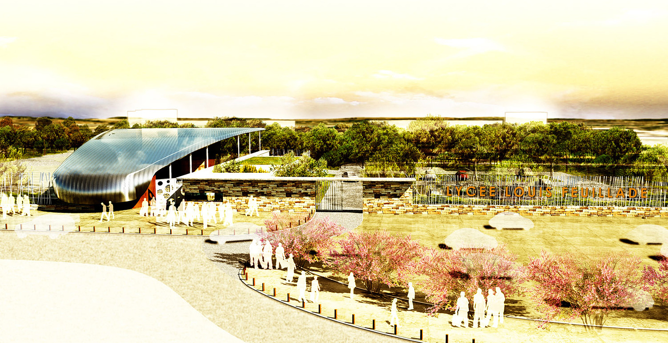
School in Montpellier, France.
You must be logged in to post a comment. Login here.
g
gregor sartin
Report Abuse
for me nothings wrong in the design itself.its unique.and ''going out of the box'' is what makes your work more appreciative and unique.for me the only problem is too saturated.too bright and contrast.but nice design.
M
Morlon Jean Bernard
Report Abuse
Hi, you are right this is more unreal illustration rather than real picture. That was my intention.
Thank you for all your posts, it is very useful, i have seen your gallery and i really love them.
Regards.
JB
Excuse my poor english.
A
Alejandro Aguilera
Report Abuse
I don't understend why...
About the render you have a tiling problem in some textures and is a little saturated for me... Although I must say it has an interesting style!

Abdullah
Report Abuse
looks like the image were in the oven for few hours. :D

mohamad Aminian
Report Abuse
Love your style of Presentation . BUT , i thnik the design is not appropriate for schools .

