Very nice and realistic images, one thing though is the text on the walls that seem like you added them in photoshop applying drop shadow effect to the layer, they are not homogeneous with the perspective.
But they still great!
Hi all,
Sorry for late reply and thank you all for your kind feedbacks and critics.
Great renders! The placement of people is very realistic, can you advise as to the source of images you have used please?
These people are very realistic, Improving even more the scene.
Great! From where you bought these great people?
We have photographed people on our own to be used in our architectural visualization work and has a huge archive of photographs of trees, people, automobiles etc.
Best Regards to All
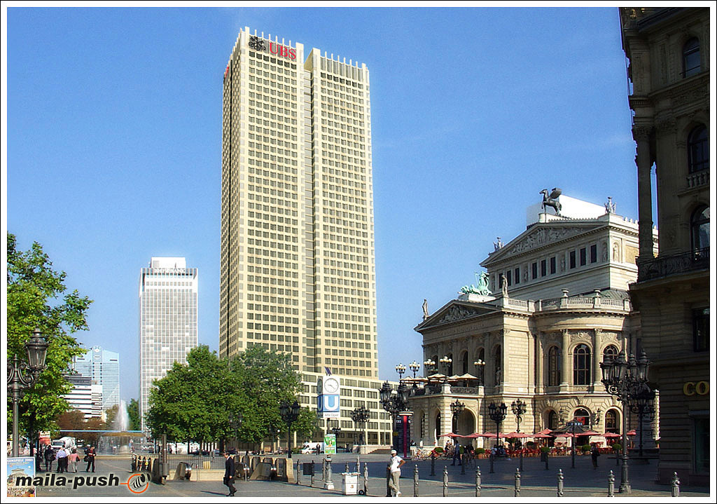
actually, in the first image, the render camera was tilted up towards the middle height of the tower, where the pov of the actual photograph is relatively close to the horizon
I think the perspective is off in the first image (the lower floors seem to retreat from the opera house where they should be parallel to it), and the colors and graininess in the airial shot need some adjustment (the tower is pretty yellow were everything else has a blue tone to it). Apart from that its really nice.
Nice internals. The people post work is great, The noggin on the dude being served at the counter here is a bit small: