Wall Artwork
You must be logged in to post a comment. Login here.

Saul Caldwell
Report Abuse
I guess it's a matter of taste. I tried to keep the scene as simple as possible so I could concentrate on the light and textures. I didn't want to over complicate things unnecessarily.
Thanks.
B
Barry dlkdld
Report Abuse
It is nice picture but it is not so attractive.
You should be create creativity in there. The color used not suited in there.
You should be add something more on wall as well as room.
Saul Caldwell
Report Abuse
Thanks for the comments. They're very much appreciated.
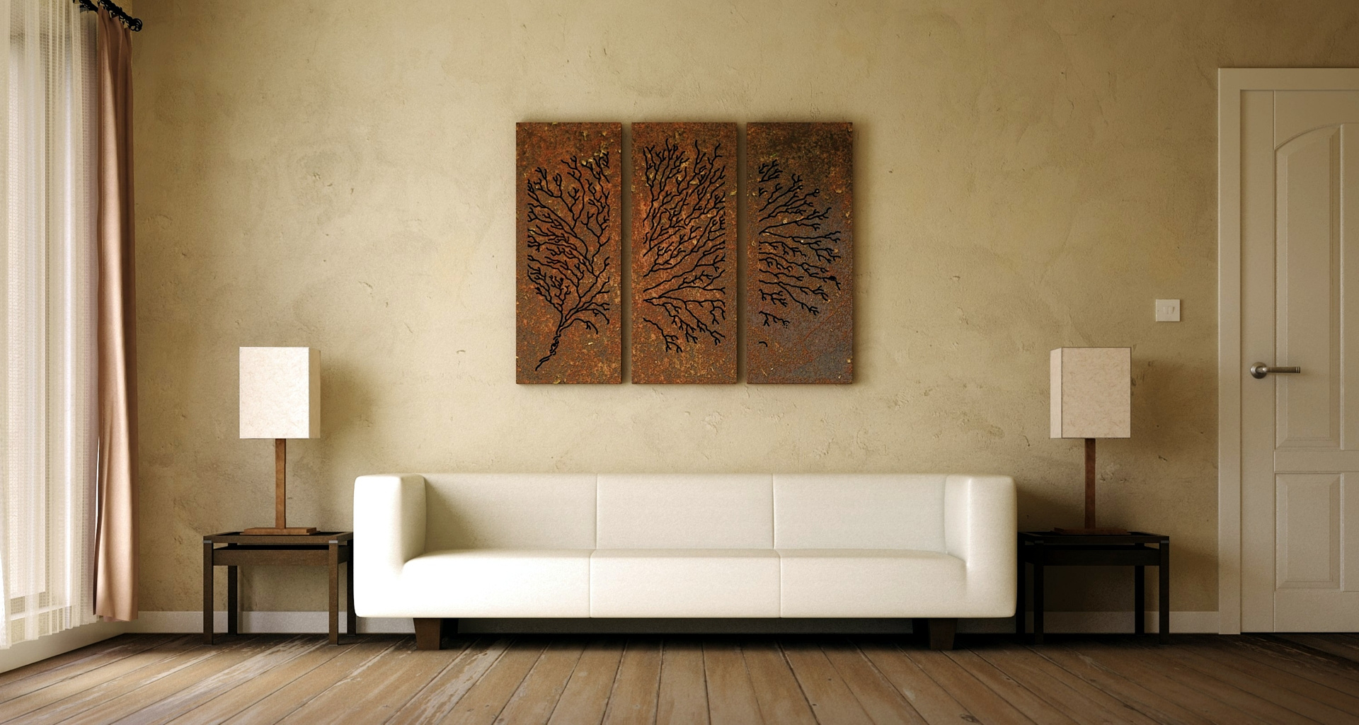
The first image is definitely the best of the two, in my opinion. It's exactly the style and feel I was trying to achieve and I'm not sure how I could improve on it. I didn't want the artwork to stand out, I wanted it to look like it belonged there and had rusted over time. Hence the other textures.
I'll certainly take on board the views about the lighting in the second image and try to be a bit more subtle next time. The next piece is a stainless steel one so should lend itself to interesting, subtle lighting.
Thanks again. :)
M
Meher Thakker
Report Abuse
great work...somehow I like the second render.. !!
Meher

Athanasios Karampitsakos
Report Abuse
I agree about the second image.

denis de backer
Report Abuse
good image, the textures are very nice. I like the atmosphere in the first image. It's very soft, zen...
The second image is too dark for me. Lamps are more visible than the artwork on the wall.
Very nice and poetic work :o)

Aubrey Millard
Report Abuse
It's good, but in the first image my attention is drawn to the sofa. The second one is where the artwork stands out nice but that render could do with some work on the lighting.
Nice art concept!