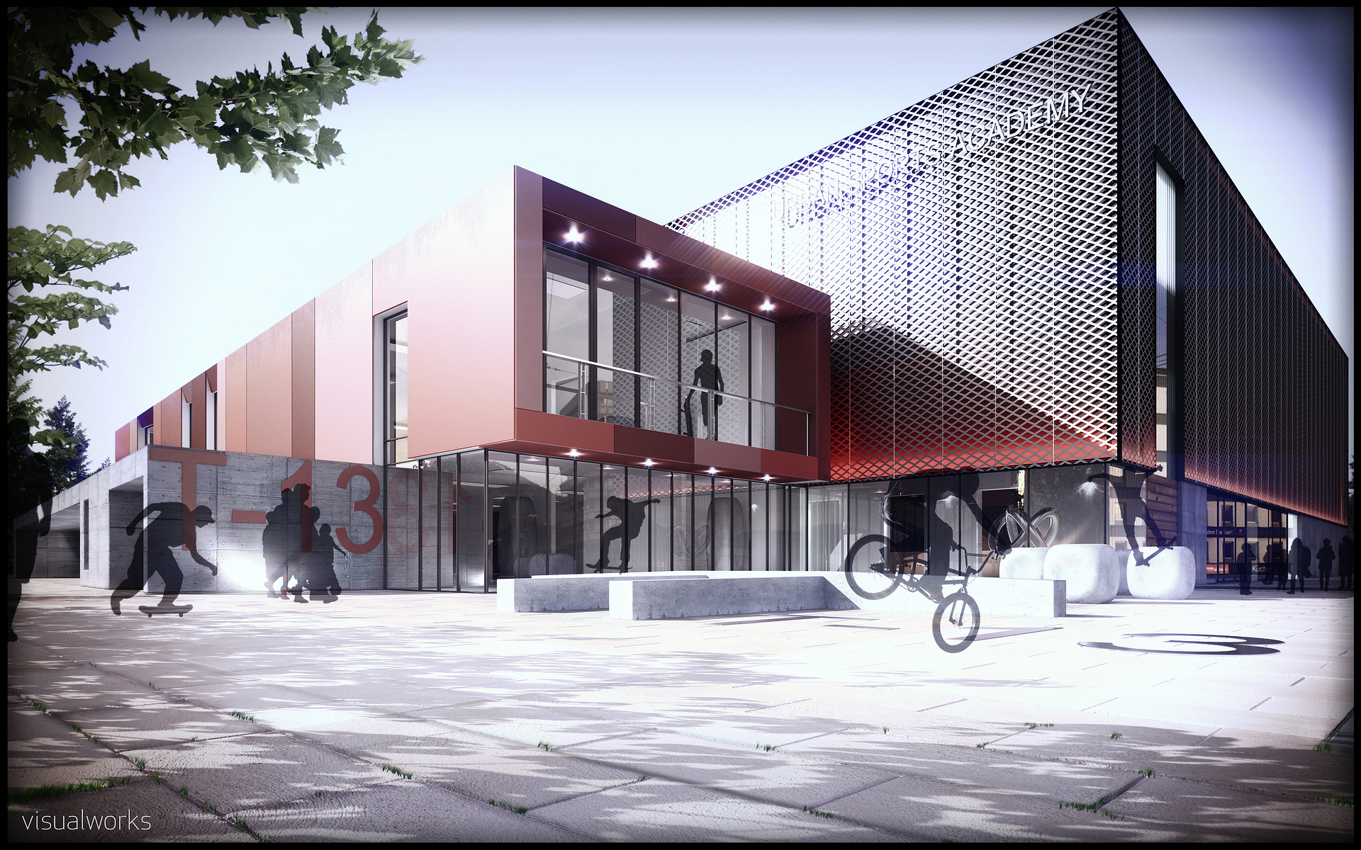
Day and night views, T-13
You must be logged in to post a comment. Login here.

Ryan Watson
Report Abuse
Is that metal panel? If so, you're going to have loads more panel joints - most fabricators have maximums around 4'x10' for a baseline. Also, for the cartoon-i-ness factor, your artificial lighting would realistically be gobbled up by the sunlight. You certainly wouldn't have any flares/bursts coming from them in this condition. That said, I prefer the feel of them rather than trying to duplicate real life.
Nice feel to the image.

Gavin McGinty
Report Abuse
Cheers folks for the kind comments...
Did another bit of post... didn't have to time to amend and re-render...
[IMG]http://i.imgur.com/ycVR4.jpg[/IMG]
T
Taylor Cupp
Report Abuse
Totally agree with the sign comments, first thing I noticed when looking at your images.
R
Randy Daynard
Report Abuse
I don't think it looks cartoonish at all. I agree with the comment about lighting up the sign. I also think you should find some other entourage to use. I don't mind silhouettes, I just don't think you want to show your client how the local extreme sports posse is going to deface their new building.

erick gustafson
Report Abuse
I quite Like your images. I however would do something (lighting wise) to make the logo on the building pop more especially in the night shot...
E
t
tristan basco
Report Abuse
If you want a realistic look, you have to go with realistic entourage and not silhouttes. You should also check your scale, in your night scene the silhoutte of a man on the left side is overscaled. The grout lines on the pavement looks inches apart. You are not far off. Most of the people here in the forum are self-taught. 3DATS, gnomon are few of the training resources that are very useful.
R
Rustam Isanchurin
Report Abuse
Well, I'm completely self-taught and tend to solve problems by myself, so it's hard for me to think of any useful training courses. The answer is most probably that there are none - I mean, there are bits of useful info throughout the internet, but I doubt there is a single training course that teaches exactly what you'd like to learn. Not to be completely helpless, Eat3d released a couple of nice texturing tutorial DVDs, but they're intended for game developers.
Gavin McGinty
Report Abuse
Cheers Rustee, That is useful advice indeed, I appreciate your help. I must look about further training into materials, dirt and so on. come to think of it I haven't really had that much proper training on materials. may as well ask.. you know any that would be of use? Vray - intermediate to advanced level
R
Rustam Isanchurin
Report Abuse
I'm not sure what do you mean by "cartoonish", your images seem quite realistic to me. If you're really going for ultimate diehard photorealistic look, you probably should think of adding more grittiness and weariness to your textures. The seams of the pavement in public spaces, for example, can't be that primordially white. You can add a bit of distortion to those red surfaces (are they metal?), and even to your glass. It's a good practice to mimic the real world geometry when you model, especially for objects with reflective surfaces. For instance, if you have large windows all over your facade, the worst thing to do is to model all the glass with only one plane, because the reflections would look very phony. Model every piece of glass separately, so you can add a tiny bit of random distortion to the transformation matrix of those glass planes, and the reflections on them will look much more vivid.
Gavin McGinty
Report Abuse
any advice on how to take my imagery from, imo "cartoon like effect" to more realism.
I prepared to spend the time and effort to do so. I'm long enough in the game already to know that hard work pays off.