first post
You must be logged in to post a comment. Login here.
Y
Yves Vdz
Report Abuse
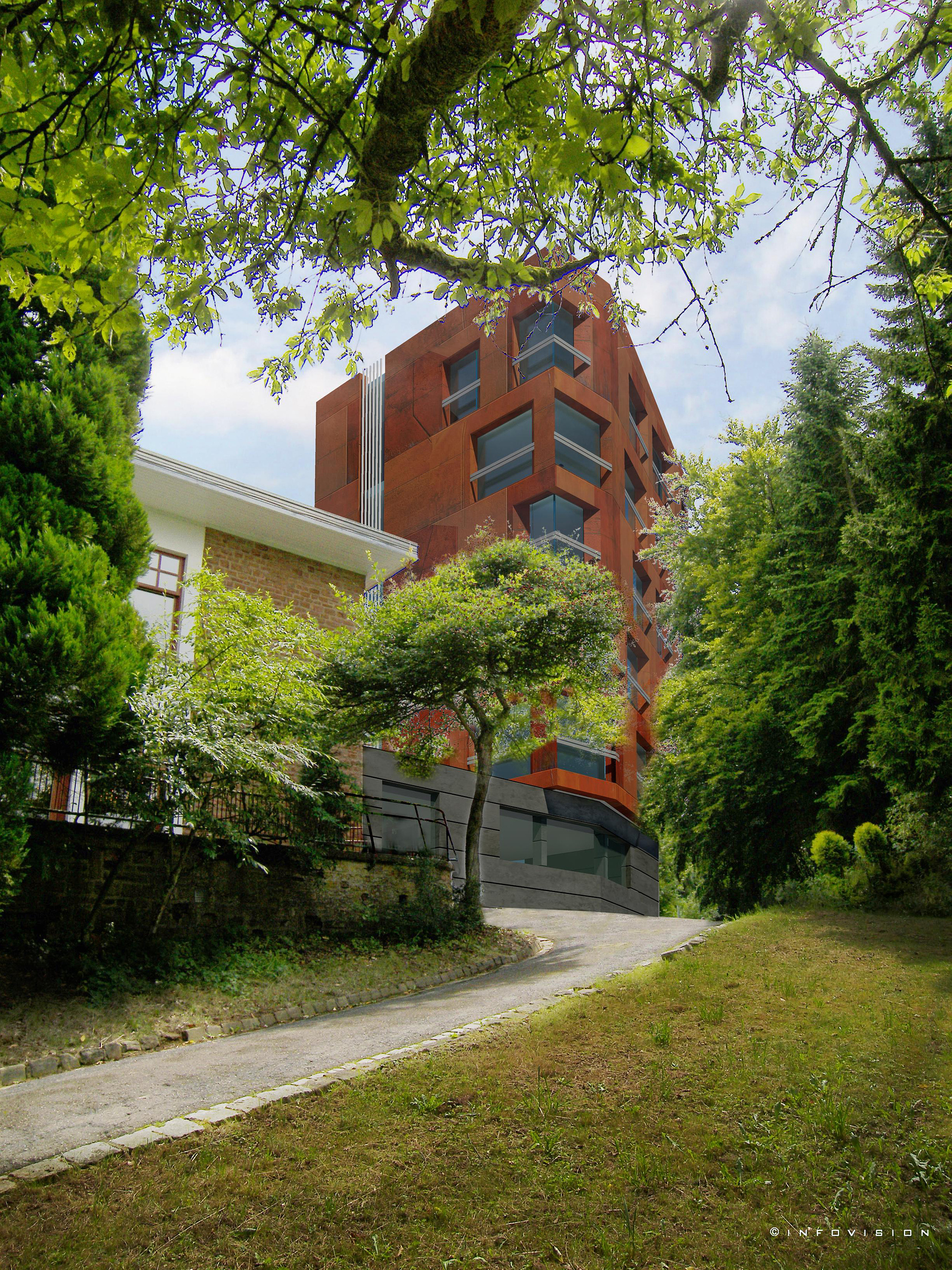
thanks for you advice and your recomandations. This pictures was made in only 2 days so I didn't have time to work on the post-production of the picture. Al the trees in the foreground were already present in the original photo because the site does'nt offer good place take correct picture. so I have to use photoshop to cut the tree to insert the model between them but I Have not enough time to make it correctly therefore the halo in the tree.
It is very ineresting to have the opinion of profesional because I'm autodidact so I'm always learning.
Thanks

Adam McPartland
Report Abuse
I agree with neko, you have really bad halo effect on the trees esp in the foreground. Its alot of effort but it'd would be worth it if you remove this. I too like the POV, very dramatic, lots of potential, i think the building just looks very cg-ish atm.
-If those panels are corten adding bump and reflection will really help with blending.
-cheat some subtle tree reflections in PS on the glazing
-look at your colour balance, photo is very green, your building is harsh red and grey...i'd adjust one of them to match
-lighting is ok just a little flat, i'd have a stronger light source from the right mayb some godrays ;) also note your shadows are darker than the photo.
This is a nice image and has potential to be very nice. Interesting to see a client prepared to hide even a tiny bit of his new building in favour of a better artwork.

paul rodham
Report Abuse
i think it's a very good at attempting to place the building in the environment and get the lighting just right. some of the photoshopping of trees needs work though.
i also like the effort in creating some intrigue and framing/composition of the image, but it does cry out for more direct and full views of what looks like an interesting piece of architecture.
are the panels steel, or wood ?