Seaside story
You must be logged in to post a comment. Login here.

Juraj Talcik
Report Abuse
Hi Hao,
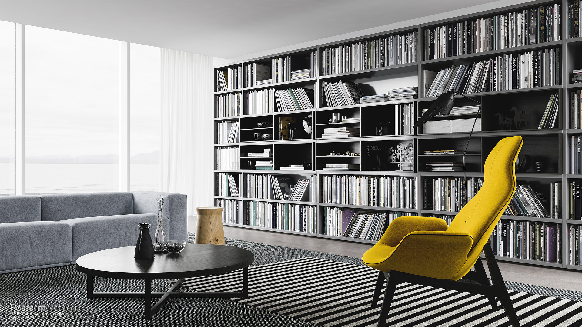
do you refer to the side lighting from the right ? It was lit like that in original photography reference and I did like it. Might be true it gives overly focus on chair that isn't compositionally in such focus but I think it's kind of ok.
One off thing I noticed is the image here loaded with improper profile (AdobeRGB) giving the chair very contrasty/saturated feel which might exarbate this feeling.
Does it look the same wrong on the link to flickr ?
If so than it is indeed my fault, altough I personally still like it.
In any case, here is "full" album and thank you for honest critique, will give it second thoughts
https://www.behance.net/gallery/Seaside-bookcase/15009523

Hao La
Report Abuse
The lighting on the yellow chair is odd to me. It makes the chair looks like it was paste in the image. Maybe this is your purpose to focus on the chair and not the composition of the entire image?

GAUTE HATLEM
Report Abuse
Nice and clean!