Home
You must be logged in to post a comment. Login here.

Adam McPartland
Report Abuse
sorry the design is 'bite the back of your hand' bad.... but every cloud...nice puddles.

Athanasios Karampitsakos
Report Abuse
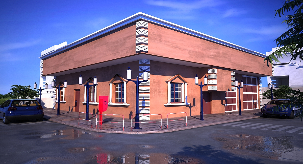
I agree the doors are for too short and the camera's perspective needs to be a little vertical in order to give a solid feeling that needs a building from that angle of view. Last think is to use two different cars and not instance it. Besides all comments your work is good and you have nice lighting and modelling. Keep up!
t
tristan basco
Report Abuse
Sorry can't help it, the design is painful to look at.
M
Mohaned Al Sabti
Report Abuse
the main door needs at least more half meter of hight, left door less than a half. the car to the right needs to be scaled more 5% extra
i like the wall finish and the lighting a lot, looks real. about the white brick! try to rise the bump percentage and reduce the reflection if exist. If you remove the blue (typical petrol stations) metal cap on top, your building will gain more value and will keep its classical touch.
success and let us see more good renders like this.
t
thecrown
Report Abuse
thank's, i'll try to minimize the car size

William Garcia
Report Abuse
It seems that the doors of the building or the cars are out of proportion.