Exterior - School
You must be logged in to post a comment. Login here.

Jonathan Sanchez
Report Abuse
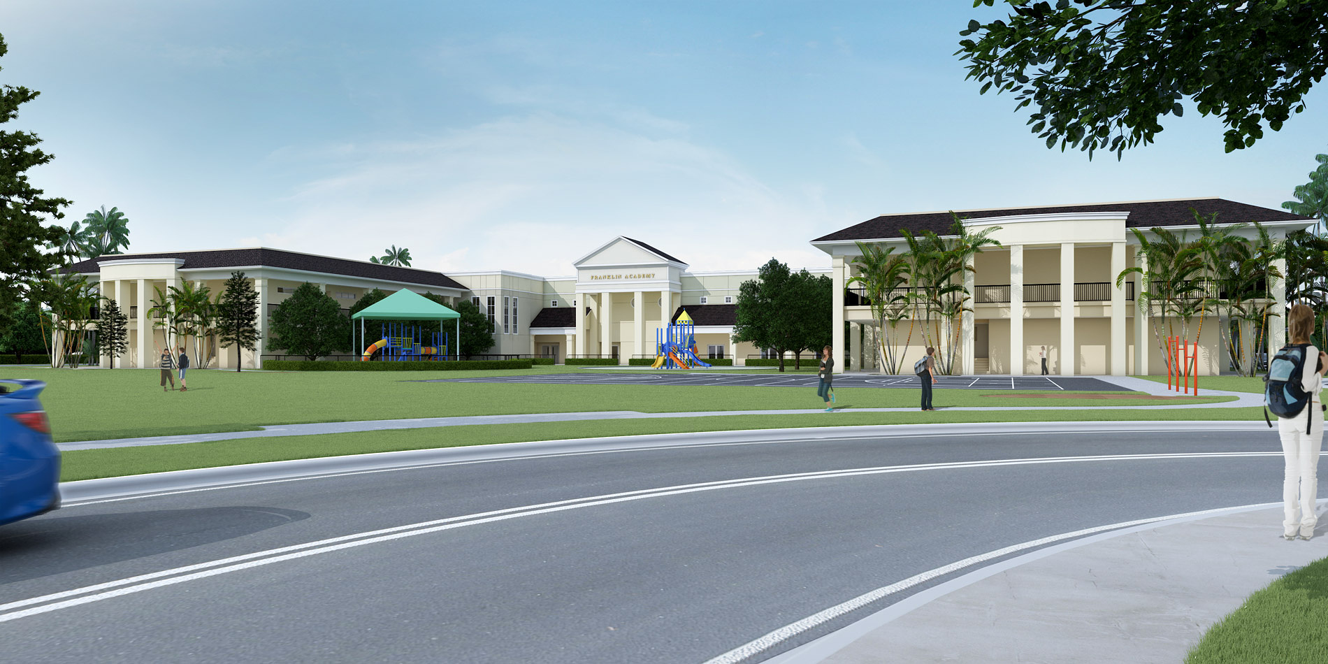
thx bradley....I did various images for this school, the others were closer to the structure, and you are right, they are better. In any case, here is another one I just finished.
edit: the cgarchitect.com filters are making my images look blurry, originals are not this blurry, don't know how to avoid this.

Bradley DeWald
Report Abuse
I understand your problem with the angle, especially since it was chosen by the client, but there HAS to be a way to get a good overall image of the building without it taking up only a sliver of the overall image.
Jonathan Sanchez
Report Abuse
Thx Odart... I guess I do need to work on contrast huh.. was trying to achieve a very soft lighting, but from feedback here I guess it's not working to well. Thx for comments everybody
O
Odart Graterol
Report Abuse
I Would do something like this...basically increase contrast, some grain and textures, depth of field...it is like "tarnish the image" a little bit.
Hope It helps and like you!
Jonathan Sanchez
Report Abuse
no, the images are done.. I was aiming for that hand drawn look, not just a typical photo-realistic render.
J
JosephAHaddad
Report Abuse
Why it seems lacking a lot of details especially the buildings in the back, colors seem like flat rendering, if I knew that it is a hand rendered image i would say it is very beautiful. I guess it still under construction right?
Jonathan Sanchez
Report Abuse
Thanks Ryan and Aniket. I agree that the cam angles chosen make the bldg seem far away, but the angles were chosen by client, and I already did closeups of playground elements in other shots, so they just wanted a shot of the entire bldg.... a classic arch viz. U r right about the car, originally was going to do car coming in to shot, but for some reason it didn't look right, worked better imo with car going out, maybe I'm just crazy :-).

Ryan Watson
Report Abuse
I'd suggest a little more contrast in the lawn - sort of flat right now. Also, perhaps more material identity on the building - hard telling what it actually is. A dirt map might suffice. Personal critique, I would omit the car in the first image or move it. When something dynamic (like the movement of a car) is traveling off the page, your eye is led off with it. Simply by reversing its direction, your eye is brought to the center of the page. Lastly, I think your images are trying to do too much. I would zoom in on the entries, or playground and give more depth/detail. Trying to convey the entire building in one rendering has resulted in the foreground and sky dominating the image.
That said, I think the modeling is very good - minor tweaks would bring real life to these! Keep it up!
a
aniket shirsat
Report Abuse
good going brother....but u still need to work on it......e.g. image is blurry....play with some other filters....all d best...