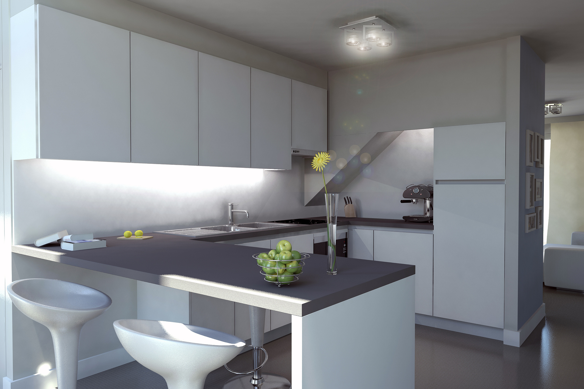
kitchen interior
You must be logged in to post a comment. Login here.

Wim Clissen
Report Abuse
thanks baker
Wim Clissen
Report Abuse
Hello Tyson,
Thank you very much for you're feedback!
Marked orange: As of the AO pass you suggest i should make a seperate AO rendering for the lemons, the books and the photo's?
Marked green: true it's a bit hard, did it in PS not in postproduction in max.
Marked yellow: actually it really needs to stand there client insists, but i understand what you are saying.
Marked blue: i don't understand you're comment here. The design is like this. Why change it? Why is it unreal?
Marked magenta: the closetdoor is in fact in front of the MDF wall. The MDF wall above the closetdoor is in the same line as the corpus of the closet. Why shouldn't it go open?
Anyway, the project is finished now here are some of the final renderings i delivered to the client. I know there are a few things to ameliorate. Maybe when i have time i can improve one of the scenes and put it in my portfolio, allthough the design is rather usual, cheap and not very special.
Kind regards.[ATTACH=CONFIG]42391[/ATTACH][ATTACH=CONFIG]42392[/ATTACH][ATTACH=CONFIG]42393[/ATTACH]
Tyson Junkers
Report Abuse
Hey! I like your modeling overall. You have some great details everywhere. I wanted to share a few thoughts I had...
[IMG]https://img.skitch.com/20110421-ncheuq8dwnhfiw88s6jhj9imd1.jpg[/IMG]

Antoine Desjardins
Report Abuse
Looking much better, keep it up.
Wim Clissen
Report Abuse
Hello Dave,
Thanks for the suggestions. You sure have a trained eye for detail.
About the materials you are certainly right, especially the polished concrete floor is a problem, i'm going to work on that. Indeed contrast between the laminate kitchendoors and the painted wall are needed i will put a slight noise on the laminate.
the apple bowl and the vase: you mean move it compositionwise?
The joint is indeed intended, it are 2 MDF plates who meet.
I indeed need to put a story in the picture, like adding drinks and a knife near the chopping board.
the cooker is a combi microwave-oven.
Here is a new version i've been working on, still need to adjust most of the things you mentioned.
[ATTACH=CONFIG]42114[/ATTACH]
You're critics are very much appreciated. Thanks.
Kind regards,

Dave Buckley
Report Abuse
with regards the neon light, put a cylinder with a self-illuminated a&d material where the neon tube would actually be?
i personally feel that the materials need some work, everything appears to be the same material with the only difference being the diffuse colour, even a subtle noise map might just give some variation in each material (the orange peel effect)
move the apple bowl and vase away from the dead centre of the image
your books are intersecting.
not sure if its meant to be obvious, but there is an obvious join between the two pieces of wall above the knife rack? this is being highlighted more by your AO
the chopping board looks a little on the small side but could be large lemons or just an optical illusion, in fact there seems to be a few scale issues.
if you are going to have props then I'd make them look a little less random, i.e. make it look lived in, the lemons are being sliced so put a knife by them from your knife rack, why are they being sliced? are they going into a drink? If so then where's the drink?
the cooker hood looks like a boiler? probably because of the simple design and the buttons/led type things on the front of it.
move the ceiling lights around a bit, meaning, have them aimed at different areas of the kitchen (same for the front room)
i'd get rid of the flower in the vase and fill it with something else, or put more flowers in it?
Apologies if I'm being picky but just my 2cents.
finally you mention grass-o-matic, if that is the only view you are going to use then I really wouldn't both, a nice background replacement in photoshop will do the trick, oh and you may have not noticed but your knife rack is hovering :)
Wim Clissen
Report Abuse
Adjusted the whole scene with gammacorrection set to 2.2.
A few minor things need to be done (texturing floor is repetitive, grass outside i'm going to use grass-o-matic with a mentalray shader, the curtains need to be remodeled, etc...)
But the main issue i have now is how to simulate a neonlight underneath the upper kitchenclosets. Haven't figured that out yet. At the moment i've used a photometric light uniform spherical with a fluorecent cool white colorsetting and a rectangular emitter. Unfortunately the neonlight needs to light evenly underneath the closet.
Anyone got suggestions on that one?
Other feedback ofcourse welcome.
Fresh rendering without postprocessing.
[ATTACH=CONFIG]42109[/ATTACH]
kind regards
Wim Clissen
Report Abuse
Hello again Tron, thanks for the help again.
As for the linear workflow i'm planning on setting my gamma to 2.2 for my next project, so the answer to you're question is no.
The diffuse bounces are set to 0, i've changed them to 2 now.
I adjusted the color of the photometric lights aswell.
Two other problems came up while working on it:
- I tried to add a beam shader to the photometric lights but when i rendered it i got a complete black result.
- When i modeled the exterior it didnt render it (i guess due to the exposure control).
Here is the adjusted result, the client didn't like the flower so i had to take it away :), also he didn't like the sunlight on the table, so i rotated the compass so the sunlight didn't came through the windows.
Mind that the rendering isn't postprocessed in photoshop yet.
[ATTACH=CONFIG]42098[/ATTACH]
Kind regards,
Antoine Desjardins
Report Abuse
Looks pretty good. I'd make the interior lights all 4200-4500K because they look like the same color temp. as the daylight system light. Also, you have a bit too much burn in the scene.. turn down the highlights in the environments tab to .25 or .2 (assuming they are higher)... which brings me to another question: are you using a linear work flow? Also, how many diffuse bounces have you set up for your FG?