Test House Scene for New Job
You must be logged in to post a comment. Login here.

Matt Vernon-Clinch
Report Abuse
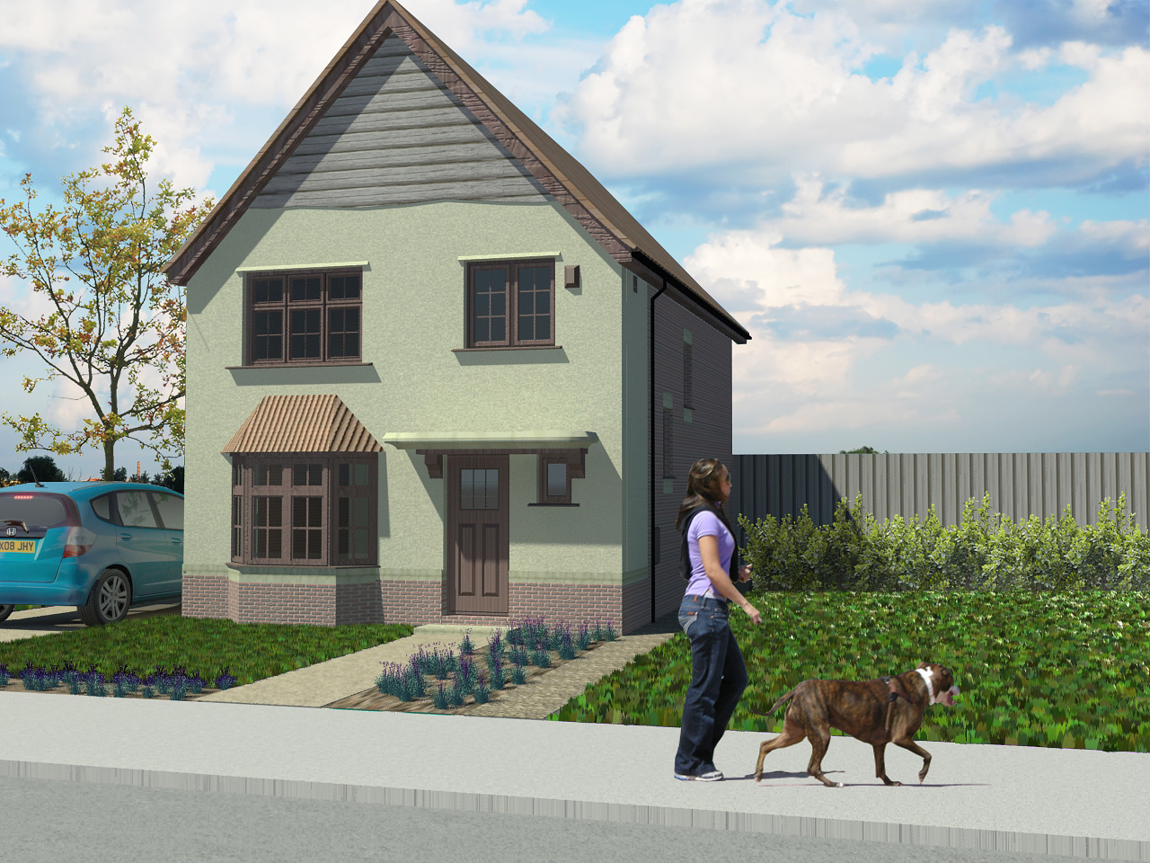
i'll give some general points that leapt out on first glance. overall, good start if this is your first stab at this kind of thing.
composition:
- tip of building just off frame is bad form. keep main objects inside frame and give 'room to breathe'
- same with car - why is it half cut off?
- odd position of building in general - why is it off to the left?
- why is the girl+dog walking off screen? its always much more pleasing and balanced if people walk 'into' the image, and don't seem to be about to leave the frame. it draws the viewer in as we naturally look where people are moving.
scale:
- find your horizon line. assuming this is eye level (ie, the camera was 1.6m above ffl and horizontal) then that's where the girls eyes should be. currently she is way to big (full height of door ?! )
- same with civic. far too big. currently nearly 2.3m-ish tall?
lighting:
- balance of highlights seems strange. currently the brightest point in your image is the dogs neck. should definitely be the sky, so the girl+dog need to be toned down a bit. also your sunlight seems generally a bit weak.
glass and other materials could do with some work too.