Hover Challenge
You must be logged in to post a comment. Login here.

Francisco Koehler
Report Abuse
Hi,
Thanks everyone for the kind comments and suggestions.
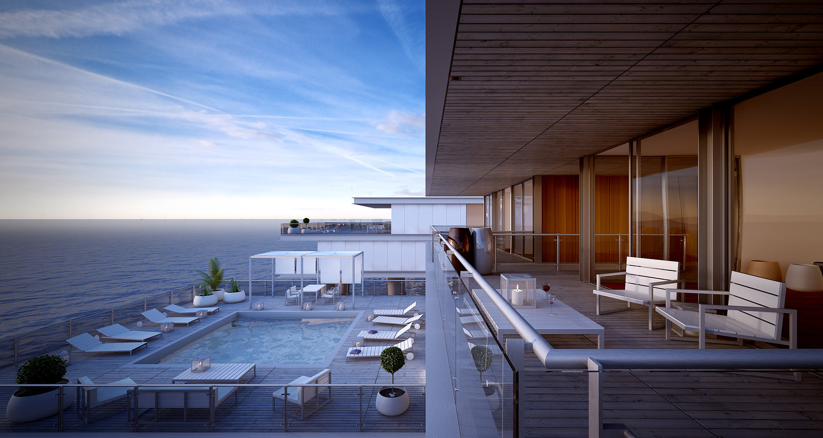
@sancheuz: the interior is very poor on detail... that's why i didn't put any lights inside although i agree that it would give more contrast.
@D_Burpee & Joseph A Haddad: I've already been given the same critics about the horizon and also about her location and I think you're quite right, it would help a lot to the composition to correct the detail.
I'm keeping this max file open for "fine tuning".
@ Dia79: Thank you and also for your help/suggestions during the challenge. Your storm image is really a beauty!
Once again thank you all for the C&C.
Cheers
J
JosephAHaddad
Report Abuse
Great image especially the warmth of the inside in contrast with the cold of the outside.
The horizon line is too sharp but it indicates a very clear cold beginning of the day.
Great Job!
D
David Burpee
Report Abuse
Wow, great work! My only (picky) comment is that I think the horizon line could use a touch more atmospheric perspective. It looks just a tad crisp, but nothing to worry about, this is a really nice render. Good luck!
M
Micael Dillner
Report Abuse
Great work Franciscok! Good luck m8 :) really great that we are in the final :)

Stephen Thomas
Report Abuse
Beautiful! I love how that vertical line bisects the image.

Jonathan Sanchez
Report Abuse
Excellent work! I would try brightening up some of the light coming in from inside the house some just for a little more contrast.. but really nice looking image you have there.