livingroom
You must be logged in to post a comment. Login here.

Jason Matthews
Report Abuse
Very nice so far. I think at this point it is a matter of material setup and light tweeks.
1st Image: There is too much shine to the pillows on the couch. Reduce the reflection value a bit. The space feels too washed out. It seems like there is the same amount of light coming out of the sliding door as there is from the window. Maybe choose a brighter source and dim the other one for heirarchy.
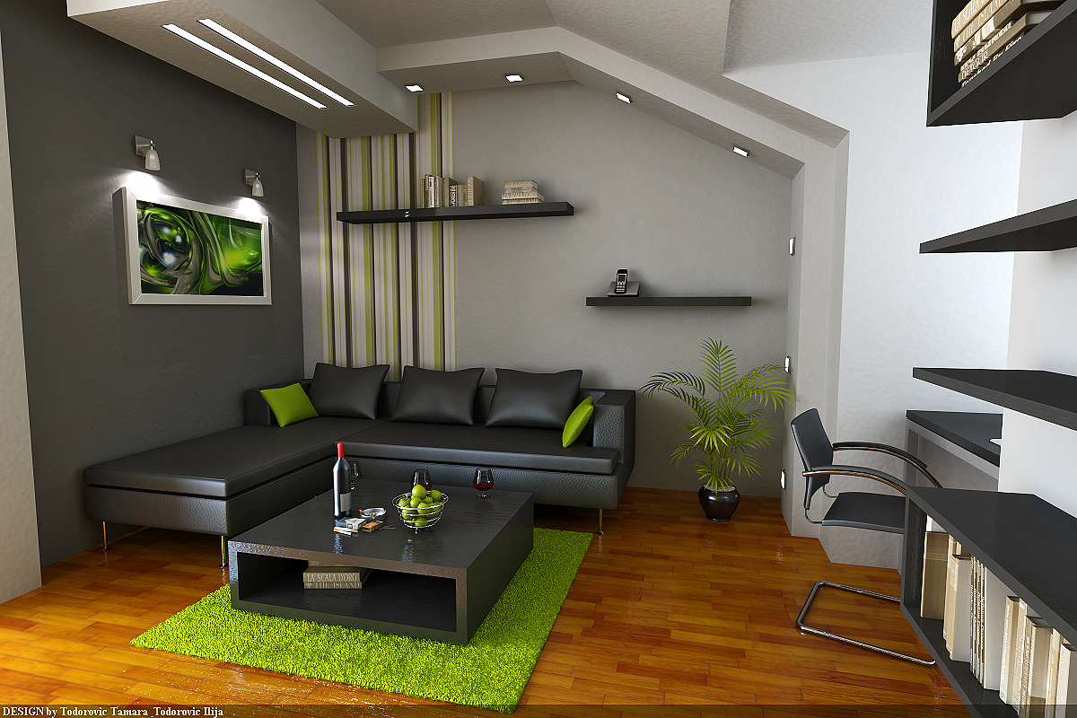
2nd Image: Floor reflection is too strong. Reduce the glossy highlight and that should take care of the exagerated bump on the floor. The couch bump map is too strong and too uniform and the reflection on it is too bright. Maybe reduce the glossy highlight on it as well. Ceiling texture is very large and too intense.
3rd Image: Pick an opening to be the brightest. The blinds on the door do not filter any light in the rendering. In reality they would filter the light and depending on the material, would glow. Also, all the light is white. Try introducing a daylight color. Coffee table bump map is too strong.
4th Image: The kitchen tiles should have a smaller relection to them, not such a large one. All of the same comments from the earlier images apply here too.
5th and 6th Image: Same commets as previous.
Overall it is very good, but as Meis Van der Rohe said, "The devil is in the details".

Athanasios Karampitsakos
Report Abuse
Quite good. Bump on the walls is too big, the floor is too glossy, lightings seems unfinished and the details needs more attention..