Brent Chamberlain and Assoc. -
Brent Chamberlain and Assoc.
Undisclosed
3DS Max, vRay, Photoshop, Photomatix
Hey there, Guys / Gals!
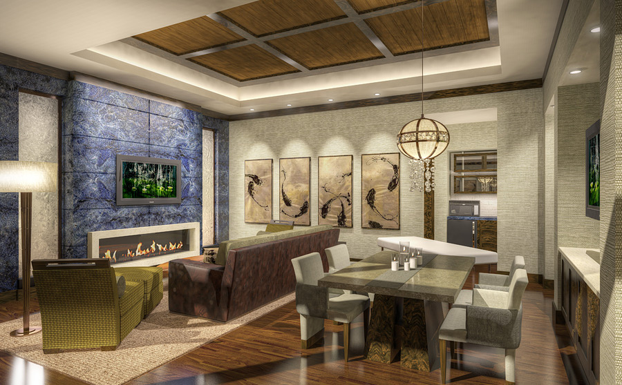
I have been experimenting with some exaggerated , and I have decided to go forward with them. These images aren't utterly photo-realistic, but they aren't meant to resemble hand work either. As you can see, they are over-saturated and graphic, but not 'over the top.' I will be posting up some of these that I plan on putting up into my upcoming newly-revamped website, and try to continue to live on making renderings for a living. ;)
Anyway, this is one of several suites for a casino [not saying where, sorry] that we wrapped up last year. I will probably be putting up some of the other suites that I did over the next few days too. This was labeled the 'Zen Suite'. Hope you like it!
- matt
Hey Guys! Thanks for the responses.... @ luc - Well, your impression of this is pretty spot on. I did do a more realistic render, then abstracted it. I didn't give it to the client this way, I just thought that I wanted to start doing so. The reason for this is that, working over the years specializing in Casino interiors, our clients never wanted photo-realistic renders... They wanted bright, flashy, glizzty images that make their casinos look unrealistic and amazing. I used to hate that, taking a decent image and making it splashy and ridiculous, but then I just sort of got used to it. Maybe I am too used to it now, and even the bad things look good. Also, I think there can be a niche market for this sort of 'look'. I have found more and more clients that have not wanted a true photorealistic rendering, but want it to be more 'painterly'. I was hoping to fill some of that niche with that sort of client, as well as being able to do regular images. I went ahead and attached the original image [its an OK rendering, nothing special really, a rush job] so you can see what it looked like before I 'hdr-ed' it. @sancheuz - I was using GI for the original [like I said above, it's attached]. Its a pretty standard vRay setup: Irr Calc medium, LC @1000, Adaptive DMC @ 2-7. If theres an issue with the shade/shadows its more likely my lighting; I tend to use standard spots with vRay shadows instead of IES lights because I feel like they have more control with the falloffs. Old system, but its always worked well enough for me. @nic - Part of the reason for that light balance is the methodology that Photomatix uses to tone-map the image and give it that unrealistic look: It highlights and brightens certain areas of the image more than others, and the only control over it is a slider. The software is very weird like that, and it distorts the original image something awful, but then again, thats pretty much its purpose. Losing out on subtle color variation, gradual shadow gradation, and other GI nuances is just a price to be paid for the filters that I ran it through to achieve this look. @renderhaus - I have pretty much made all my excuses in the paragraphs above, but you are totally right; This image IS flat, overlit, and unrealistic. But I still like it, and I wondered what the community-at-large thought about it. I have never felt that an image had to be totally realistic to sell the idea of a design, much the same way that architects can use just the imagery they need to get their point across. A good example of what I mean is from Yama, just a week ago, who posted up with a concept design for his friend. Its not strictly photo-realistic, but it gets the point across very well. You could argue that his image is elegant and simple, and mine is garish and busy, and you'e be right. But the idea is still what I am trying to work out... Can I use this sort of image, poor as it may seem to our eyes, to sell designs? Will people that don't know anything about what really makes a rendering realistic respond better to this sort of image than to my original, which itself lacks any sparkle? Lol, maybe I should just put my time into making better images in the first place, and try not to cut so many corners, but thats hard when I am making a quarter of what I did in 2006 and I am doing better work. Just looking for a quick way out, or maybe a niche to pander to those that don't know any better. :) Thanks for your input, fellas / ladies! I really do appreciate it! - matt