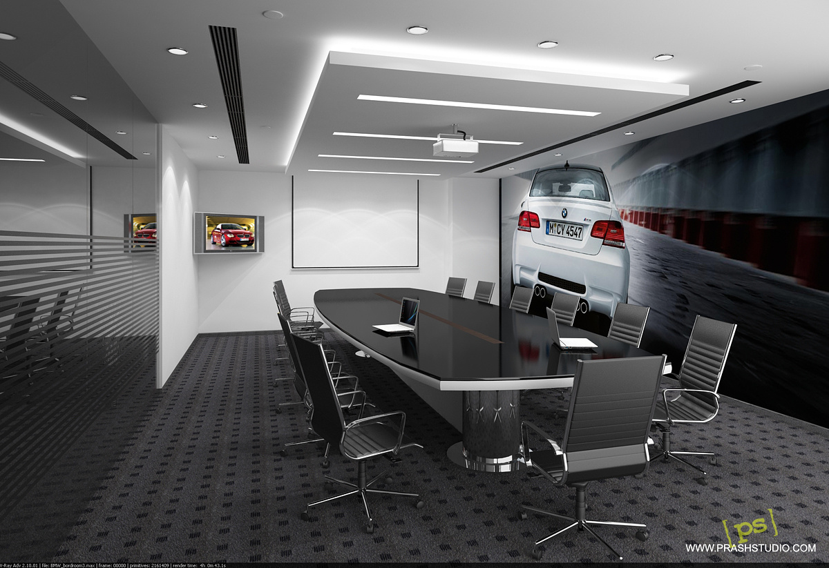
BMW boardroom
You must be logged in to post a comment. Login here.

Prashant Sahai
Report Abuse
Thank you Aubrey and Abdullah, your nice words kept me going. Thanks.
@Hao La: I'll definitely try the angle with different size ratio. Although it'll be more towards the image composition than telling the design scheme to the client ;-) . As that part is already completed, so I'll do it for me and try as you suggest. Thanks.

Hao La
Report Abuse
In my opinion, it has some dramatic feel to the image. You can even step back a little more to get a better composition (using the rule of third will help). If it hit the wall, try camera clipping.
This angle plus works well with the image on the wall. It tells the story better, the wider lens + angle suggest 'motion' (for a car company, it is a good thing!?)
Don't afraid to try different size ratio (square ratio may help to capture more of the floor)
Best,

Aubrey Millard
Report Abuse
Now it looks like a monitor. Abdullah and I appreciate the effort :)
Prashant Sahai
Report Abuse
[ATTACH=CONFIG]46056[/ATTACH]
Hi Aubrey and Abdullah,
this shot I render for you, only with glass over tv screen. :)
Prashant Sahai
Report Abuse
Thanks Hao La, somehow you are right about the "look at me" feel of the tv. But realistically we can't match the content of the tv to the boardroom environment :-)
and I render another shot as per your suggestion, (although I tried then already) and you can see that this is not good composition :)
[ATTACH=CONFIG]46055[/ATTACH]
Hao La
Report Abuse
I think if you used something simillar color tone as in the bigger poster and apply to the TV.
Right now that little TV is screaming "look at me" at the corner!
The composition could be better, the camera should move to the left and its target moves to the right to put the conference table and big poster wall in the main focus (camera lens could be a little wider)
Prashant Sahai
Report Abuse
Thank you guys for liking it :).
About the television set: it was a functional requirement and we don't have any other space or orientation which could be useful for the board members. So we left only with that corner.
And yes Aubrey, it did not contain a glossy surface in front of the illuminating screen. May be I should place a glass in front of it. Next time I'll keep your advice in mind.
About the modelling: I did not modeled the chairs (although I can easily). They comes from a free resource a long time ago... I think it was in 3ds, and the laptop.
But I optimized them for my purpose and put the materials on it. Otherwise it's all mine.:)
Thanks again for your concern.
Aubrey Millard
Report Abuse
I wouldn't leave it blank either, I just think the image doesn't look right as an image on a monitor, maybe because there are no reflections from the screen. Then again, maybe it's just my eyes :)

Abdullah
Report Abuse
in a word. wow. great image and clean render. I do not agree with aubrey about the monitor. If you would leave that space blank it would not look good. congrats. great job.
Aubrey Millard
Report Abuse
Nice materials and lighting, the modeling is good too. Did you model it all?
The only thing I don't like is the image on the monitor in the corner. It just doesn't look right.
Other than that, nice render. :)