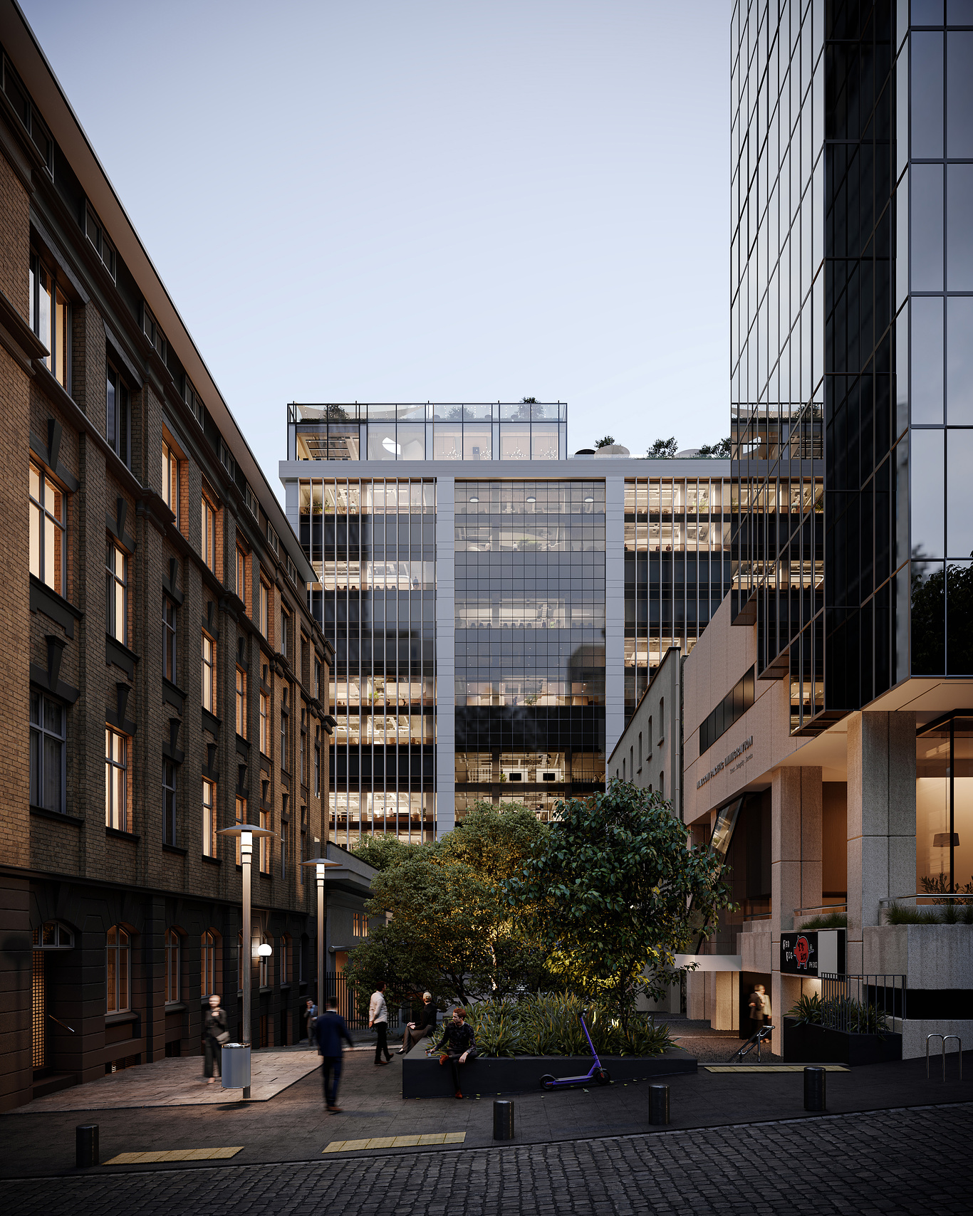
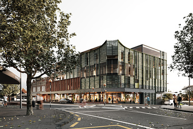
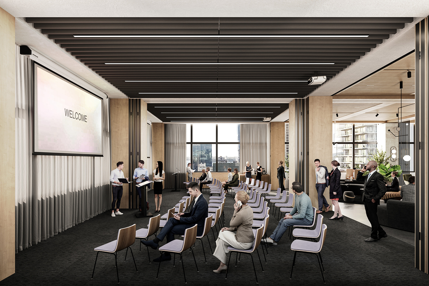
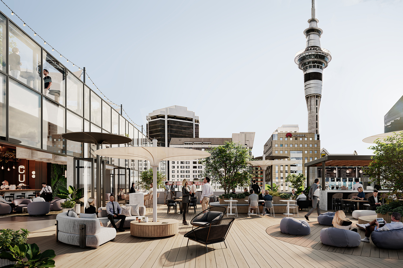
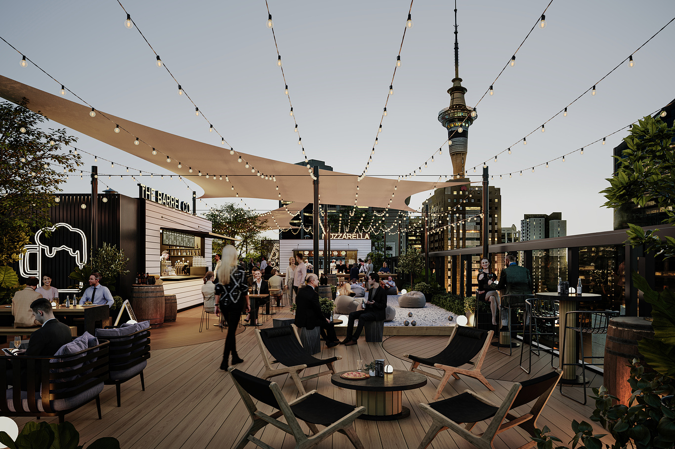
Situated in the heart of the Auckland CBD, 280 Central is a mixed-use commercial precinct developed by Stonewood Group. Stonewood’s vision was to reinvent the original 1970’s tower into a premium commercial hub that revitalises Queen Street’s underutilised midtown quarter.
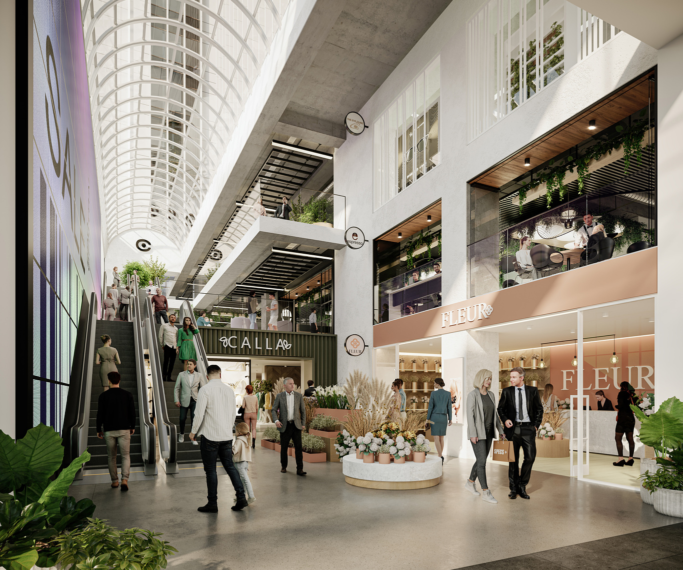
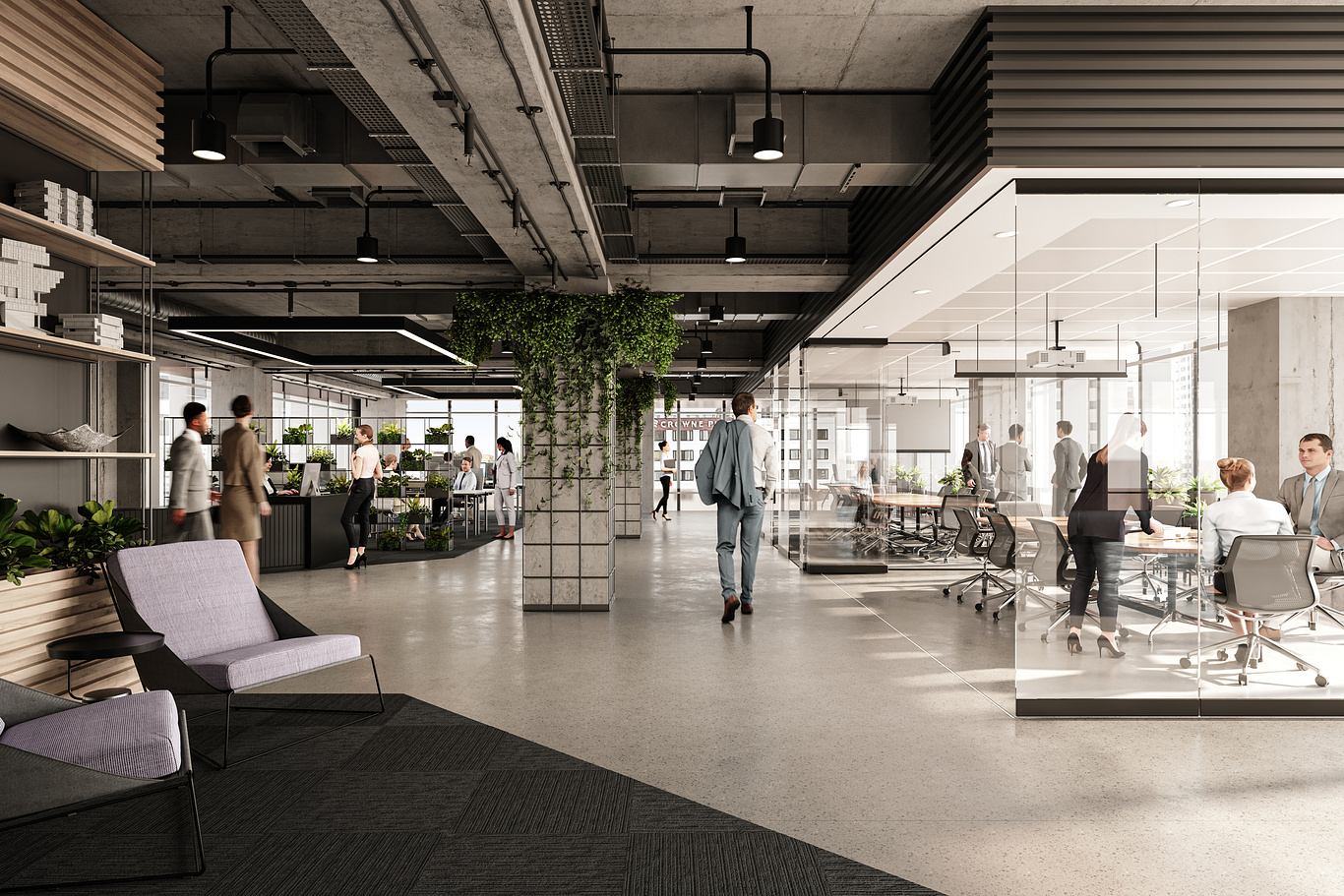
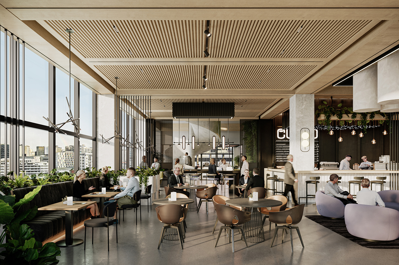
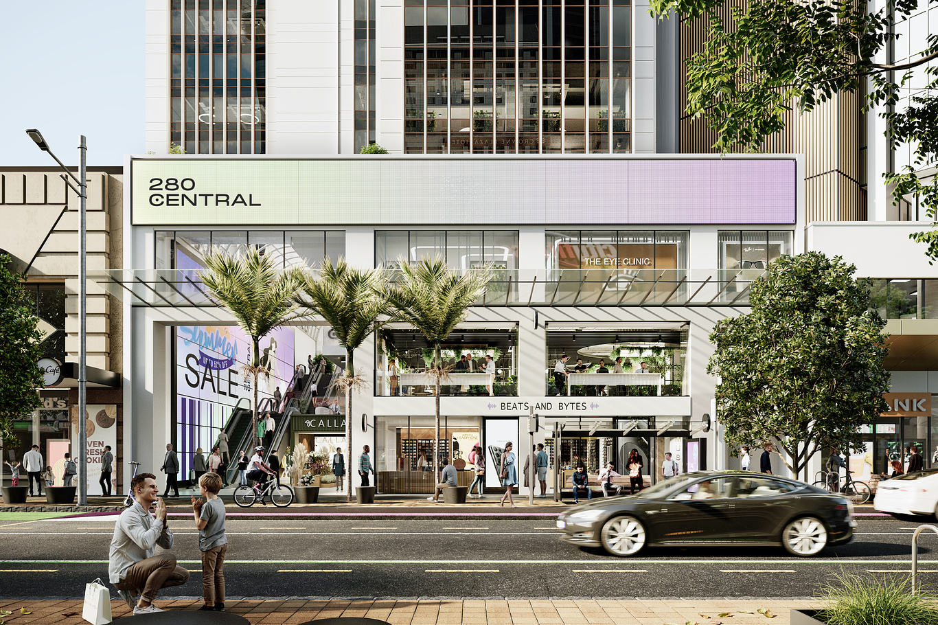
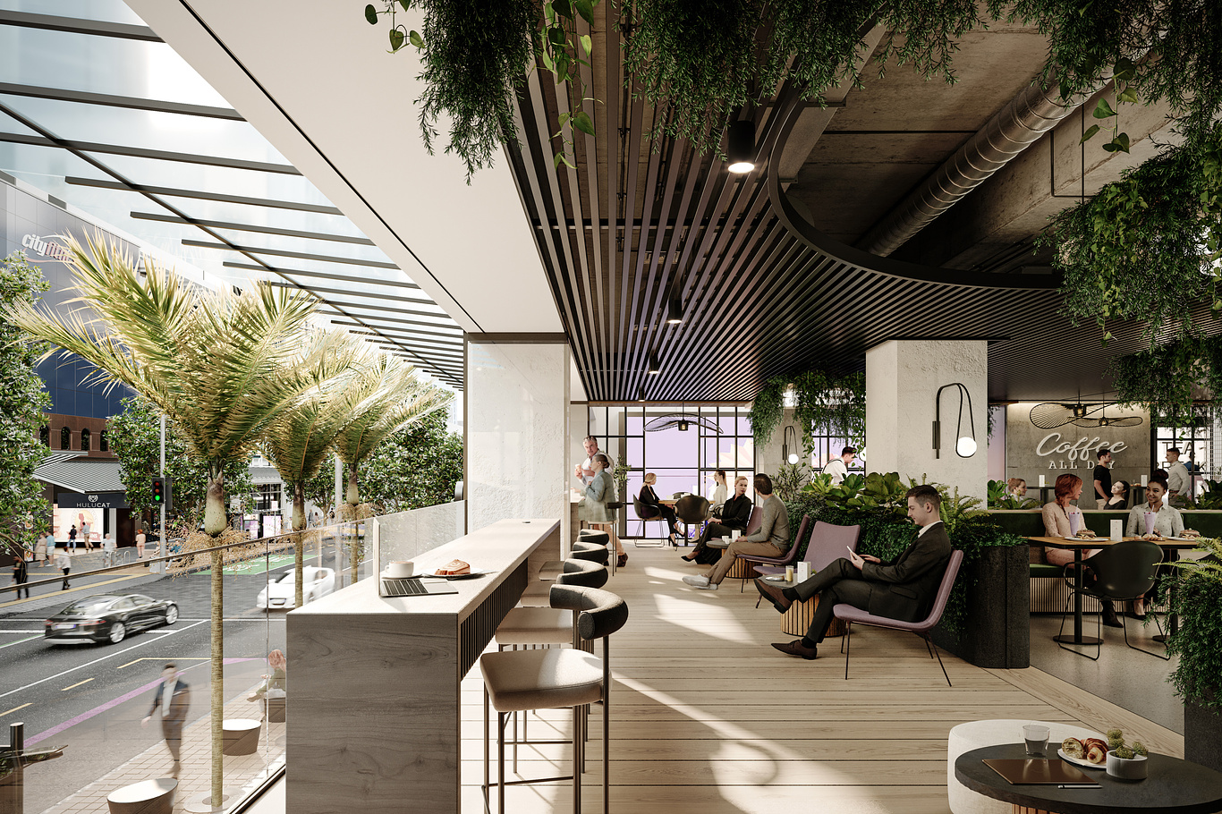
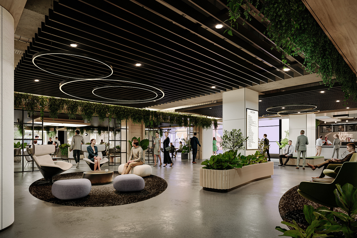
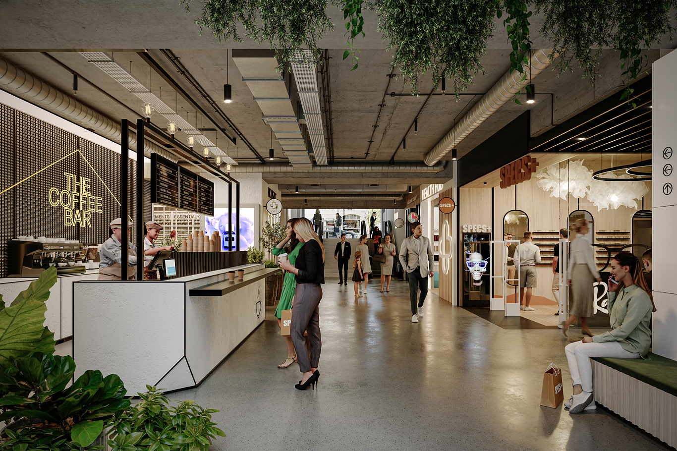
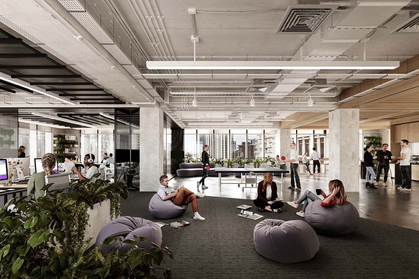
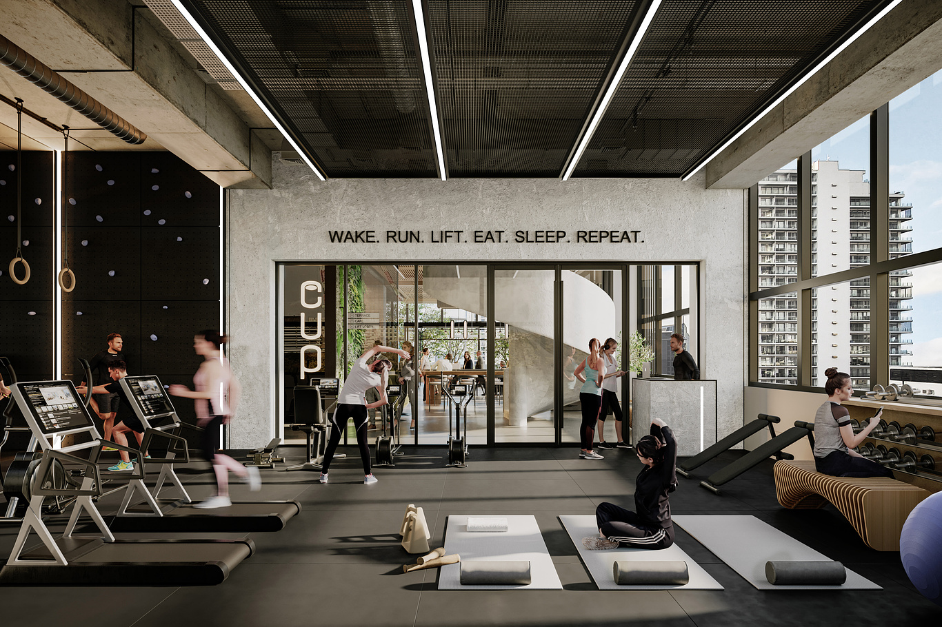
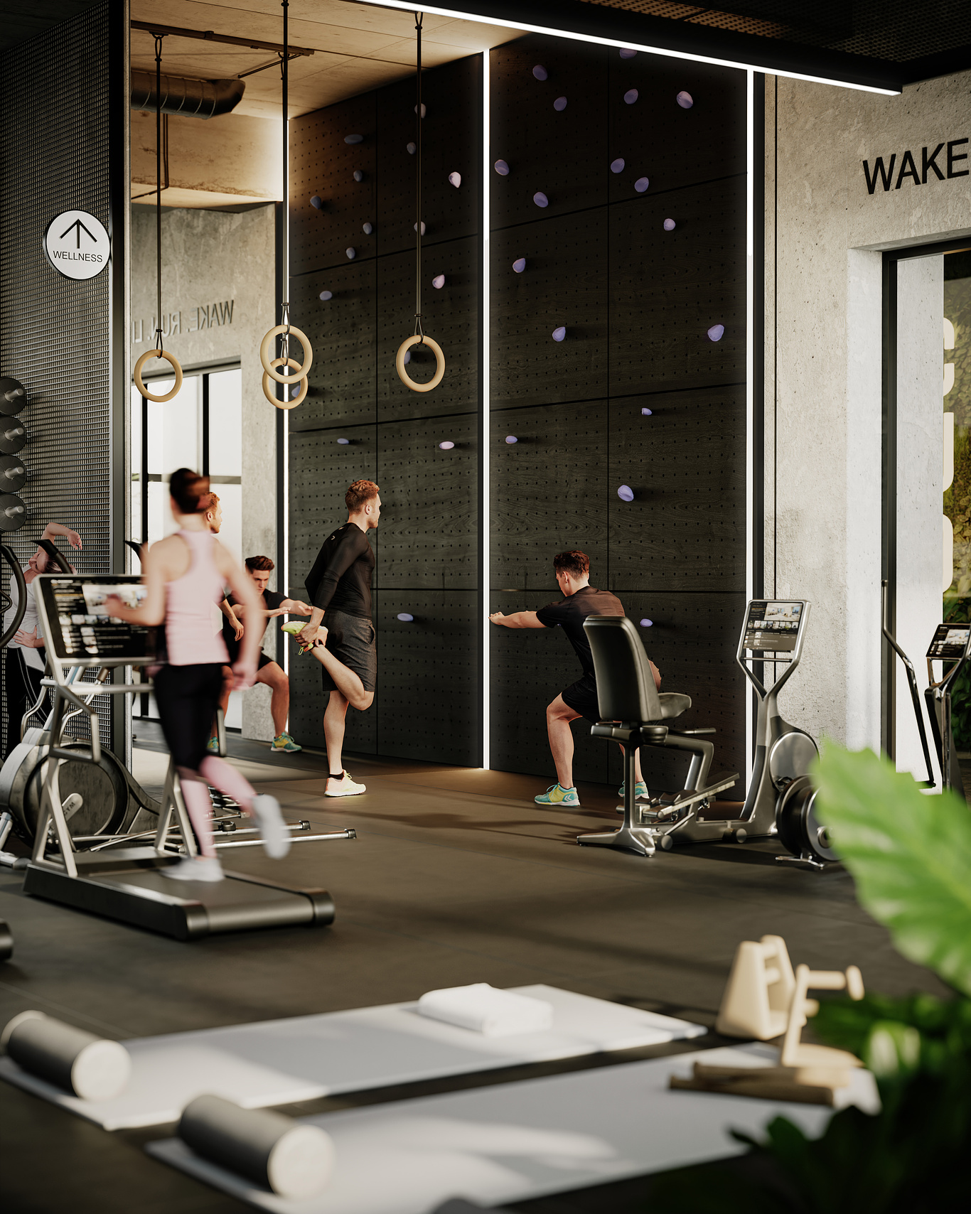
Our challenge was to create a set of renders that captures the remarkable metamorphosis of 280 Queen Street into a magnetic and pivotal destination within the Auckland CBD. Targeting forward-thinking businesses poised to seize the opportunities presented by a transforming city-centre, our strategy was to position the development at the epicentre of urban activity and dynamic change. Our approach involved designing an indicative fitout for the many spaces and facilities offered int he building- embodying the progressive and aspirational mindset of a community making a lasting impact - an audience we refer to as "centrally-minded."
Our design team also created a brand strategy, visual identity and marketing collateral for the project. Our brand identity exudes distinction and draws inspiration from the world of technology, utilising a subdued colour palette punctuated with vibrant accents. This aesthetic choice captures the essence of design innovation and sustainability, both key attributes of 280 Central. Throughout the brand, we employ a simple graphic language focused around the idea of being at "the centre." Our verbal language revolves tightly around the core concept of the location, employing keywords that assert the notion of "central" at every opportunity.
See the full
branding case study on the
OTOH website.


Actually just two artists. Took about three months (there was no design so we had to create moodboards for each space before modelling it up)
Awesome work! How many people woked on this project and how long?