Michael Brown - Glass tower
You must be logged in to post a comment. Login here.

Tom Livings
Report Abuse
Hello Mike, congrats on image of the week, however, Im going to play bad cop and pull some errors on this one....
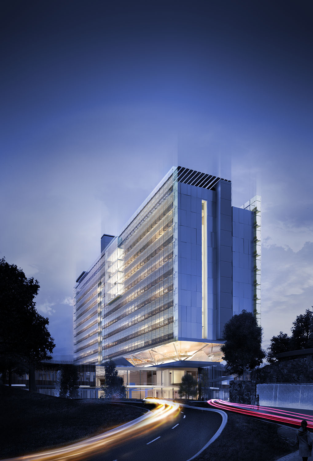
Its a nicely rendered building but I think the Photoshop work is sloppy. Starting with the sky. The sky really sets the tone in an image like this and this one seems quite cobbled together. It has mis-matched tones and a lack of depth. Is it made up of about 3 images?
The trees are a bit haphazard, they look like daylit tress that have been messed with to make them night trees and a couple look see-through.
The grass is way out of scale and the car light trails are unconvincing. It kind of looks like all the elements on the lower right corner are fighting each other.
Sorry, just saying what I see.

Travis Schmiesing
Report Abuse
Nice job Mr. Brown.
My only comments are that my eye seems to rest somewhere between the transition piece between the base and the tower, but it then meanders a bit towards the base. From your description I feel like it should be getting pulled up the facade to see all the details. Not sure if that is an intensity level of the lights doing that, or something else.
I would also prefer to see a much deeper blue/black across the top of the sky, and working its way slightly down the left side. Right now the upper portion of the sky feels to cyan to me. But that may just be a personal taste item.
Maybe you should change your name
to Michael Brown, VPW. ;)

Stan Zaslavsky
Report Abuse
great work Mike - i like how the building fades into the sky ... there are some nice PS effects there :) mind sharing what the tool was to get that effect?