Ease
You must be logged in to post a comment. Login here.
g
george sandoval
Report Abuse
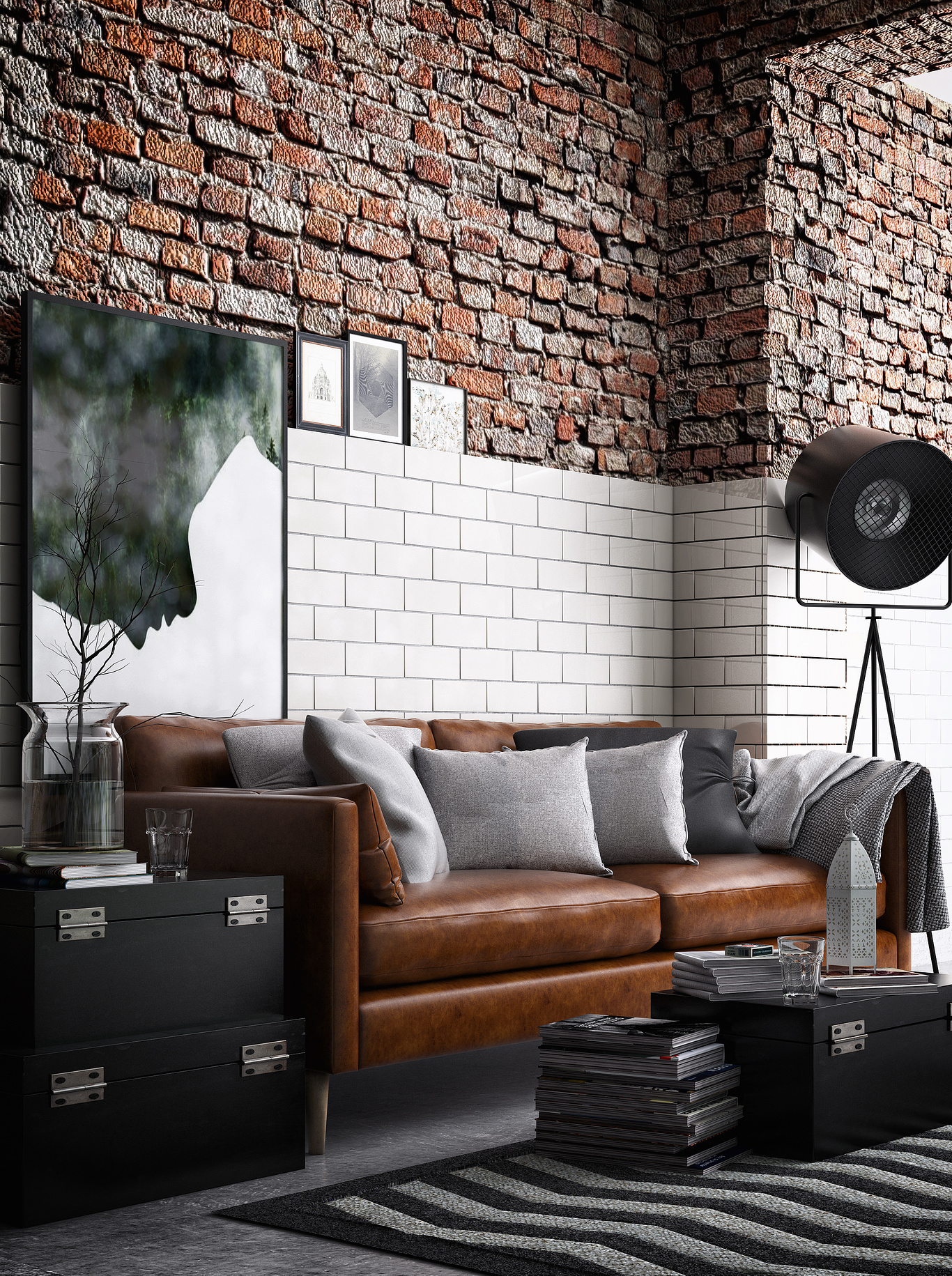
whoa! That brick is way to dominant.
And the white of the graphic is disturbing the shape your tile area - find something that contrasts - not confuses.
Fix those 2 things and it will be almost perfecto.
Those pictures are sitting too precariously on the tile edge - like a gust of wind could blow them over.
Also they seem timidly placed.

