Unfinished Kitchen
You must be logged in to post a comment. Login here.

Nicolas Bischoff (www.burn.co.za)
Report Abuse
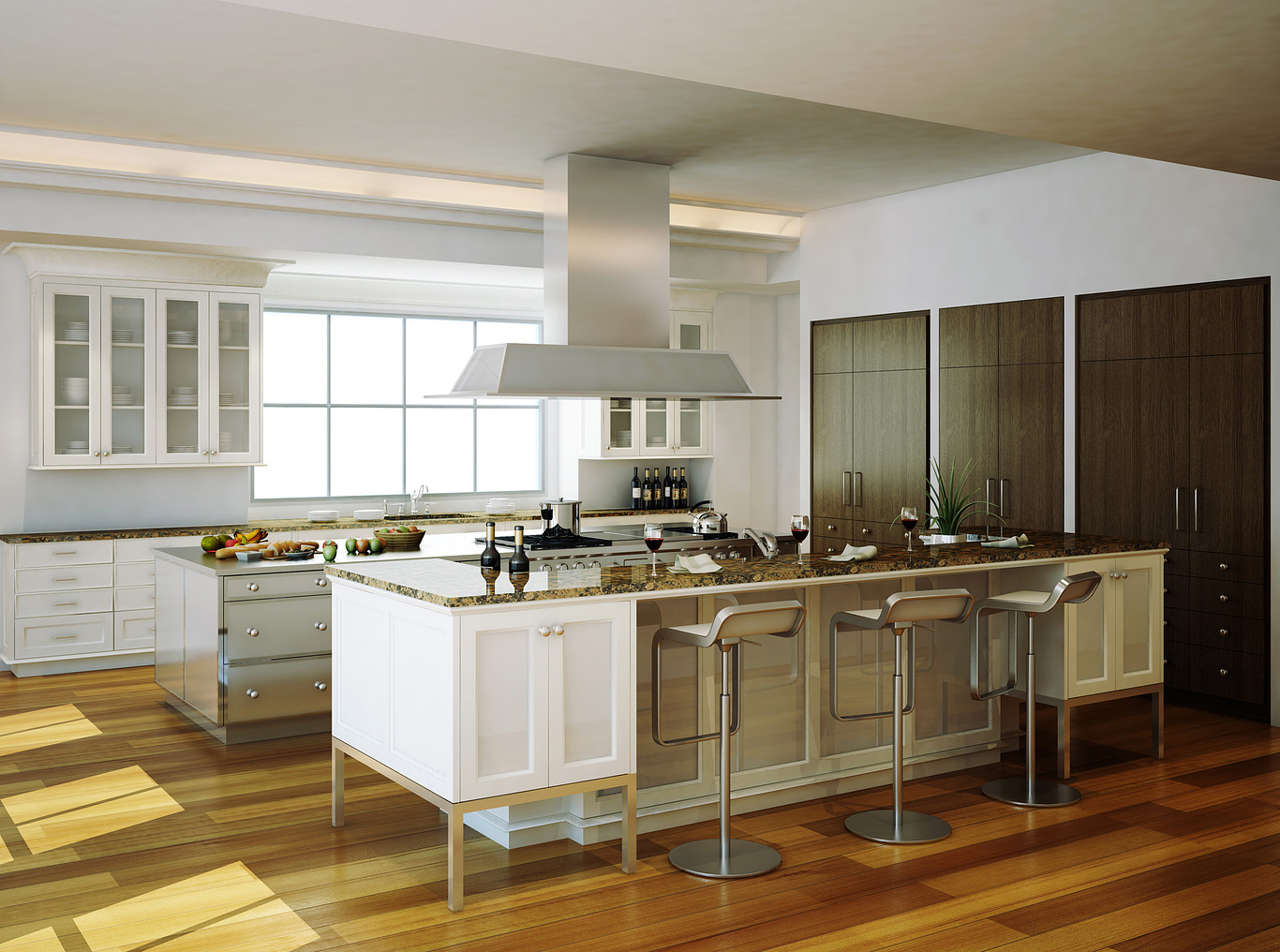
Can't fault the render in quality terms. I thnk its the camera angle thats bothering you. The target is too low and the camera high, everything else is perfect.

Rendering.no
Report Abuse
Hi, I would move the camera or make some changes to the cieling , especialy in the upper right corner ... you have there a visible part of the cieling that does not help you at all. Another thing I would change is the direct (sun ) light , the fact that I see on the floor the shadows tells me that there is a lot of empty space in the left, put a plant or something there, it will also make the shadows more interesting. I would also to make the shadows more diffuse . I would also change the floor or the texture of the cabinets on the right, and a subtle colored courtain would fill in well.
Hope it hepls. Good work
N
NerWe
Report Abuse
Hi, can you tell me how did you manage to fix those sampling issues? I had the same problem on my last project and I didn't manage to solve it. Thanx in advance

Bradley DeWald
Report Abuse
I'll give it a try. Keep the comments coming!

Dave Buckley
Report Abuse
and then when you've taken the picture from your kitchen you can go round all your relatives and take some from there for variation :)

Dave Buckley
Report Abuse
go outside and stand in front of your kitchen window facing outwards. take a picture. use that on a vray light material with enough intensity so it blows out but not to the point where you can't see it.
and I agree with andy, you need to go closer.
put your camera in 'walkthrough' mode and have a walk around the space until you find an interesting composition

Bradley DeWald
Report Abuse
Great suggestions, guys. I've already begun making changes. For the view out the window. What do you suggest? What does anybody suggest? It's always such a key point to an image: whatever is out that window, in the center of the image, is going to be the first thing that draws your eye. Greenery out the window doesn't feel right in this situation. Neither does a blue sky. I usually use a green/yellow-rolling-hills backdrop, but I refuse to use it on another rendering. What do you guys think?

Andrew Lynn
Report Abuse
It's the composition that's not doing it for me. Can you get more in there, get the camera past that foreground soffit, anything that engages the frame better will help.
g
george sandoval
Report Abuse
Quick 1st impressions. Floor slats look wide. Exhaust hood looks dull compared to all the shiny stuff below it. Back wall counter looks empty and plain. Needs more stuff. Cabinets above need more stuff - stacks of plates, stacks of bowls. Can you get reflections off the cab glass? Can they be natural wood? If I take my hand and crop to edge of the window on the left everything seems more together.
It strange that you're stuck with 3 counters in a row that are the same height - creates a kind of monotony. I don't see any lighting other than the wall cove lighting. I think some can lights above and maybe some pendants hanging down over the eating area would help. Can you have some light under the cabs?
I see you have a timid plant over by the brown doors. I would put one in the foreground coming into the frame - cheap trick but it works. Horizontal thin blinds over that big window would give it a designer look. Yeah, I would say that back wall needs to be jazzed up to match the rest of the rendering
m
marwan s
Report Abuse
..imo u should move the sunlight, the diagonal it s forming doesn't look good, put a background instead of white. the floor reflection and material can be more detailed, unless it s how it really looks like. the ceiling looks very calm compared to the design. as for colors, it s like there s a sudden contrast in the closets on the right, but overall it s a good image

