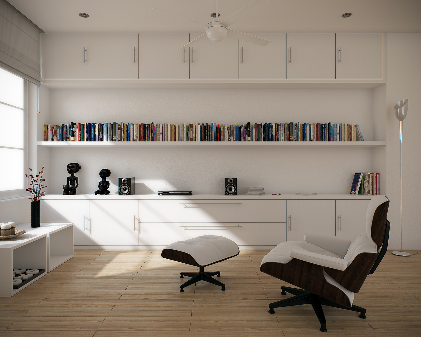
Interior practice
You must be logged in to post a comment. Login here.

Francisco Garcia
Report Abuse
thanx!!

Francisco Garcia
Report Abuse
gracias señor!!! :)
R
Riad Abi Chahla
Report Abuse
The middle shelf should be thicker or u should add a support in its middle... since it wont hold all those books
Nice lighting

Héctor Martínez García
Report Abuse
muy buen trabajo fargot! ... me gusto mas tu imagen nocturna... alomejor algo mas calida para dar el contraste con el blanco.
Me gusto mucho el brillo de la madera satinada blanca!
Saludos!

Francisco Garcia
Report Abuse
thanks all for your comments. They are very useful for me, i'm glad when i get this kind of critics, they all are from a different perspective of mine. So it's cool to read them, so i can improve myself.

Ryan Watson
Report Abuse
Rendering wise - well done. The lighting in both schemes is quite good.
Architectural wise - pretty darn boring. I think there is a difference between a clean minimalist feel and an overly stoic space devoid of character. The white material is the easy out and doesn't really test your ability as a designer nor a cgartist. The only interest in the scene is the imported 3rd party objects.
Sorry this is a bit harsh. I do think the rendering is good, but could be pushed a lot harder.
Gilbert Leon
Report Abuse
Very nice! I like the clean look.
However, the wood floor seams look a bit odd.
I
Ismael 1-1
Report Abuse
Nice and crispy! The only problem that jumps at me is the 77th book...

Francisco Garcia
Report Abuse
[ATTACH=CONFIG]41020[/ATTACH]
Night view

