Mountain View
You must be logged in to post a comment. Login here.
Y
Yauhen
Report Abuse
thanks for comments!

Jonathan Sanchez
Report Abuse
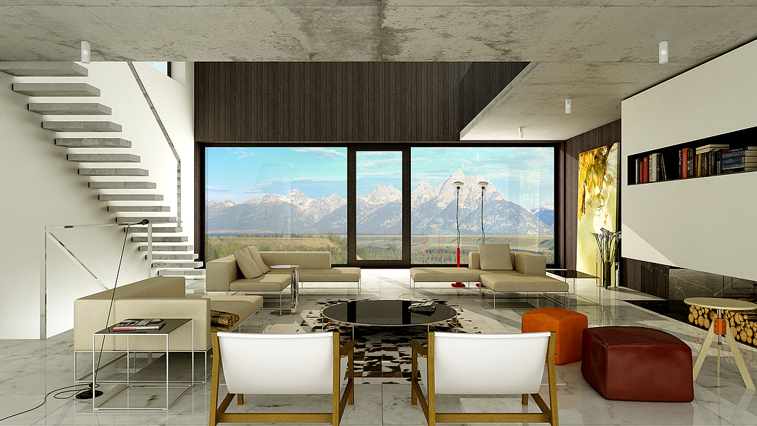
Everything looks real good to me except the foreground chairs. There's something weird going on with their color/lighting.. almost as if they were not reflecting any GI.

Fadi soueidi
Report Abuse
true there is place for improvement but i found it nice sharp and clean in a stylish way
Good work

Athanasios Karampitsakos
Report Abuse
I agree with braddewald, it looks a little artificial and flat.
John Dollus
Report Abuse
a one point is usually reserved for a very formal presentation that this particular scene doesn't seem to call for. Also, the arrangement of the chairs directly in front of the camera and facing away forms a harsh barrier to the viewer which is probably not what you want to do. If you cut down on some of the foreground clutter, light the scene primarily by that gorgeous view and keep the faces parallel to the camera as a source of contrast, then it would pull the eye into the scene more and make the viewer feel more engaged.

Bradley DeWald
Report Abuse
Nice composition and framing. Some stuff looks a little artificial, but it's a great rendering overall.