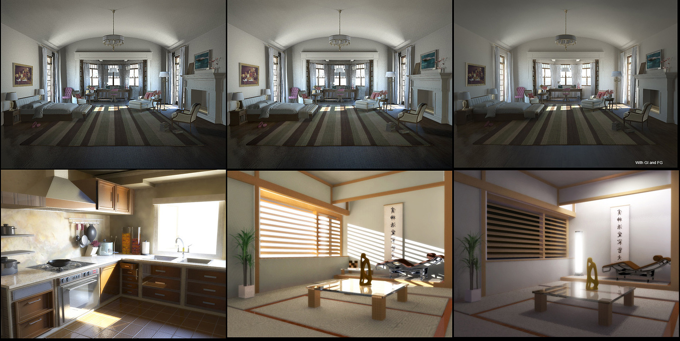
Lighting and rendering Critique Requested
You must be logged in to post a comment. Login here.
S
Satish Jogi
Report Abuse
Hi
1. I think, for the 3 images at the top, you really need to get the camera angle right, i dont know if it looks too high or the lens or positioning is wrong, because somehow, with this angle image doesnt look believable. I think that will help with visual a lot.
2. The kitchen looks quite good! Probably you can try to remove some patches in the window side of the wall. Also try to bring out the chrome, wherever you have it in the scene.
3. Lastly, the second last visual is better than the last, with the sunlight. However you should work more on the lighting, try to make it more natural, trace your sunlight, its bounces mentally or in the scene, and try to add lights in the direction of the reflected rays.. Helps, if you place it carefully.
Good luck
b
berjis
Report Abuse
I want to thank you all for your comments and helps...

Stanislav Orekhov
Report Abuse
Hi,
try to increase contrast. Add fake lights(for example blue color or yellow) from back of the camera. Turn on all lights at the rooms to make more light spots that will take view to them. add background - we must see what is inside
add more glossy on all
N
Nick Rozwadowski
Report Abuse
img 1-3 - bring camera in closer, increase gamma or GI - your midtones are dark and it makes the whole image a bit gloomy.
img 4 - try to tone down your overbright light source and add a background image
img 5 - the horizontal blinds are leaving a really sharp line on the wall. Try to blur those a bit.
Try adding a tree outline opacity map to your light source and add a background map to the outside. Showing a hint of trees/shadow will bring it to life.
img 6 - the outside sky is never 0,0,0 black. Give it a dark blue and maybe a hint of moonlight glow out there.
A
Alyosha Cebokli
Report Abuse
Hey, everything looks tiny because you're using very low focal lenght for the camera in order to encompass entire room.
My guess is you're using around 24 or even less? For interior scenes try to stick to 28-40, and instead invest more effort into placing cameras better
No need to encompass entire room at any costs, it just looks silly then.

Hao La
Report Abuse
These should go to WIP section so you will be able to get more critique.

Athanasios Karampitsakos
Report Abuse
I like the abmitalia's suggestion
r
ralf kirsch
Report Abuse
Suggestion
[ATTACH=CONFIG]38287[/ATTACH]
RK
b
berjis
Report Abuse
Thank you for your reply... here are higher resolution images.
[ATTACH=CONFIG]38285[/ATTACH]
GI+FG
[ATTACH=CONFIG]38286[/ATTACH]
no GI
r
ralf kirsch
Report Abuse
With the first three in a row: Is this the famous game '' there are 7 differencies , tell us at least 5 '' ... May be these are good renders, but everything's realy tiny . The chair in the forground seems to have selfglowing cloth and is too much illuminated. try to post a higher quality. Greatings . RK

