Arq Miguel Montemayor - http://www.facebook.com/pages/Killswitch-Concurso-de-render-Arquinauta-Bticino/128668393844871
Arq Miguel Montemayor
None
ACAD/3DSMAX/VRAY/PS
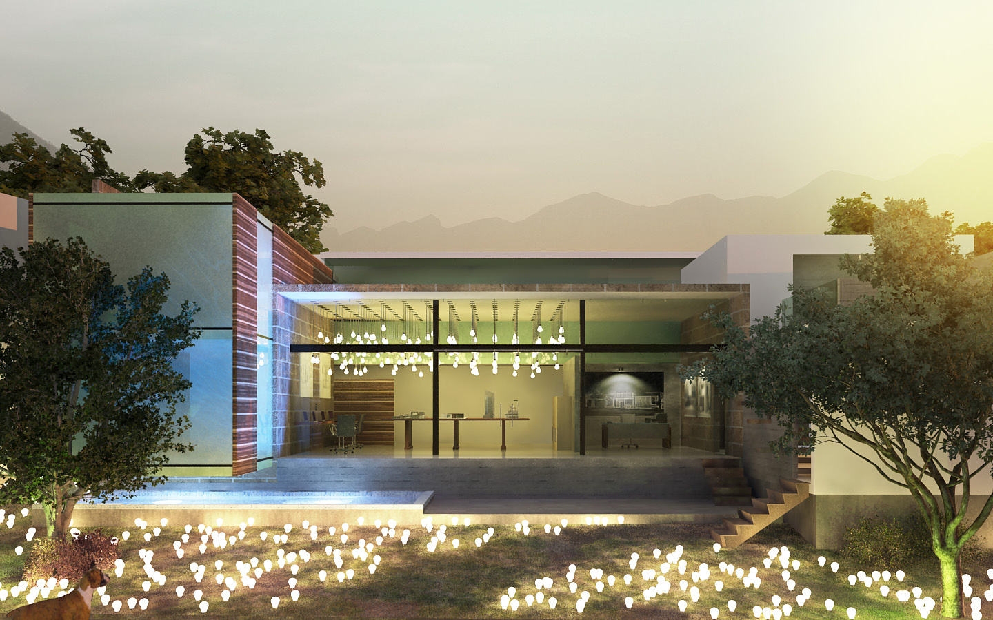
This is my submission to an arch viz contest. We had to model a house, but changing main materials (i also changed the use) and also i gave it some extra metaphorical meaning (not requested). My theme is architectural office, the metaphore are light bulb representing ideas and the mood is that for our profession ideas come often in the most strange hours, for example afterhours. I'm representing cgarchitect here, you can vote for me here:
Cheers, hope you like it
Second image here: